Column 1
Column 2
Column 3
Column 4
Column 5
20 Mar 2023
These layouts all use the Responsive Columns layout system.
Download All Demos
(responsive-columns.zip 155k)
In this article, I will cover the various types of five-column layouts and show how easy they are to create with the Responsive Columns layout system. You can download all of these demos with the handy link above.
Let's get started.
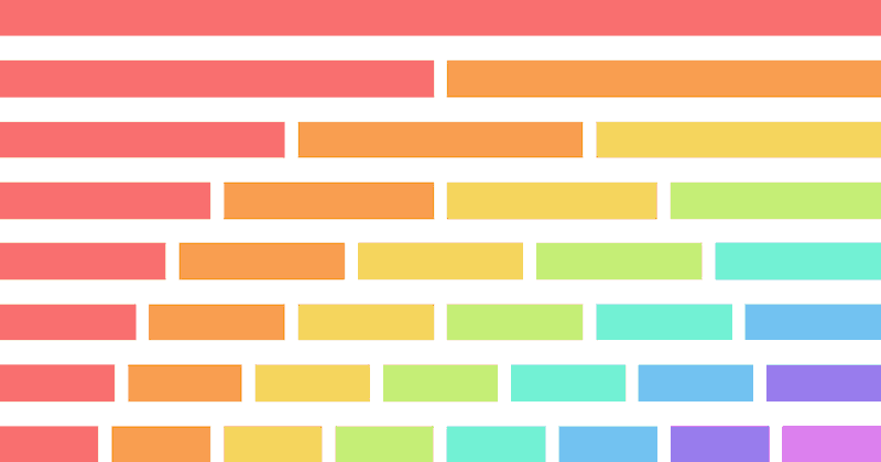
In this five-column layout, the columns stay side-by-side even on small mobile screens.
1
2
3
4
5
<r-c join>
    <c1-5 class="red">
        <!-- 1 -->
    </c1-5>
    <c1-5 class="orange">
        <!-- 2 -->
    </c1-5>
    <c1-5 class="yellow">
        <!-- 3 -->
    </c1-5>
    <c1-5 class="green">
        <!-- 4 -->
    </c1-5>
    <c1-5 class="aqua">
        <!-- 5 -->
    </c1-5>
</r-c>
We add the 'join' attribute to remove all gutters, join the columns together, and add padding. Learn more about gutter mode and join mode in the documentation.
.red {
    background:#f97171;
}
.orange {
    background:#f99e50;
}
.yellow {
    background:#f5d55f;
}
.green {
    background:#c5ed77;
}
.aqua {
    background:#72f1d4;
}
We only need CSS for the background colors, all the structural CSS is handled by the Responsive Columns system.
In this five-column layout, the columns are stacked on mobile, two columns wide on tablet portrait, three columns wide on tablet landscape, and five columns wide on desktop.
1
2
3
4
5
<r-c join sm1-2 md1-3 lg1-5>
    <c1-1 class="red">
        <!-- 1 -->
    </c1-1>
    <c1-1 class="orange">
        <!-- 2 -->
    </c1-1>
    <c1-1 class="yellow">
        <!-- 3 -->
    </c1-1>
    <c1-1 class="green">
        <!-- 4 -->
    </c1-1>
    <c1-1 class="aqua">
        <!-- 5 -->
    </c1-1>
</r-c>
Add as many columns as you like and they will follow the same number of columns per breakpoint.
.red {
    background:#f97171;
}
.orange {
    background:#f99e50;
}
.yellow {
    background:#f5d55f;
}
.green {
    background:#c5ed77;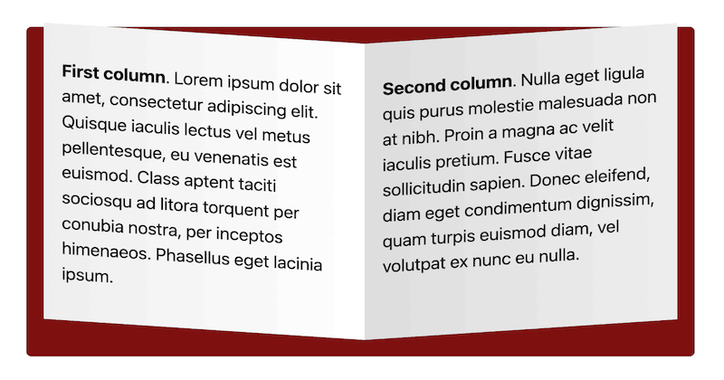
}In this five-column layout, the columns are separated by gutters. The columns stack vertically on mobile, are two columns wide on tablet portrait, and three columns wide on tablet landscape.
When in two and three column mode, the first column is made two columns wide so both columns are even at the bottom.
First column. Lorem ipsum dolor sit amet, consectetur adipiscing elit. Quisque iaculis lectus vel metus pellentesque, eu venenatis est euismod.
Second column. Nulla eget ligula quis purus molestie malesuada non at nibh. Proin a magna ac velit iaculis pretium. Fusce vitae sollicitudin sapien.
Third column. Quisque iaculis lectus vel metus pellentesque, eu venenatis est euismod. Lorem ipsum dolor sit amet, consectetur adipiscing elit.
Fourth column. Proin a magna ac velit iaculis pretium. Nulla eget ligula quis purus molestie malesuada non at nibh. Fusce vitae sollicitudin sapien.
Fifth column. Nulla eget ligula quis purus molestie malesuada non at nibh. Proin a magna ac velit iaculis pretium. Fusce vitae sollicitudin sapien.
<r-c>
    <c1-1 md2-3>
        <!-- first column -->
    </c1-1>
    <c1-1 sm1-2 md1-3>
        <!-- second column -->
    </c1-1>
    <c1-1 sm1-2 md1-3>
        <!-- third column -->
    </c1-1>
    <c1-1 sm1-2 md1-3>
        <!-- fourth column -->
    </c1-1>
    <c1-1 sm1-2 md1-3>
        <!-- fifth column -->
    </c1-1>
</r-c>
The Responsive Columns layout system uses tiny custom HTML tags that make coding responsive layouts a breeze. You don't need to know any complicated CSS. See the documentation for more details on the custom HTML tags.
No CSS is required for this layout because all the work is done by the Responsive Columns system.
This five-column layout uses semantic HTML5 tags. The columns stack on mobile, are two wide on tablet portrait, four wide on tablet landscape, and five columns wide on desktop.
Column 1
Column 2
Column 3
Column 4
Column 5
<article data-r-c data-join>
    <section data-c1-1 data-sm1-2 data-md1-4 data-lg1-5 class="red">
        <!-- Column 1 -->
    </section>
    <section data-c1-1 data-sm1-2 data-md1-4 data-lg1-5 class="orange">
        <!-- Column 2 -->
    </section>
    <section data-c1-1 data-sm1-2 data-md1-4 data-lg1-5 class="yellow">
        <!-- Column 3 -->
    </section>
    <section data-c1-1 data-sm1-2 data-md1-4 data-lg1-5 class="green">
        <!-- Column 4 -->
    </section>
    <section data-c1-1 data-sm1-2 data-md1-4 data-lg1-5 class="aqua">
        <!-- Column 5 -->
    </section>
</article>
The Responsive Columns system is compatible with semantic tags. Full details here: How to use semantic HTML tags with responsive columns.
.red {
    background:#f97171;
}
.orange {
    background:#f99e50;
}
.yellow {
    background:#f5d55f;
}
.green {
    background:#c5ed77;
}
.aqua {
    background:#72f1d4;
}Responsive Columns works in all modern browsers, plus all old browsers that support Flexbox:
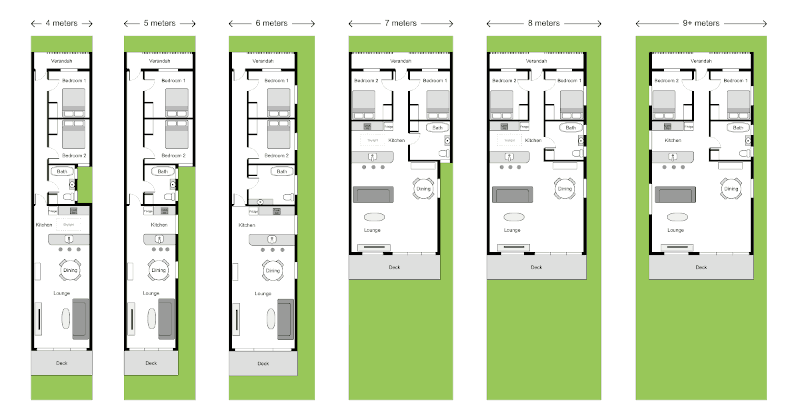
If you need to achieve 5 equal-height columns in old browsers (back to IE 5.5) that don't support flexbox CSS, you can use my nested equal-height columns method, here is an example of a 5 column layout without flexbox.
You can easily change the widths of your columns and change how they respond to different screen sizes.
Refer to the Responsive Columns Documentation to see how easy it is to create responsive layouts to your exact requirements.
ID vs Class: Which CSS Selector Should You Use?
Holy Grail 3-Column Responsive Layout
Equal-Height Columns
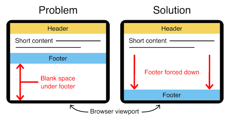
Bottom Footer
How to add CSS to HTML
Responsive Columns:
Responsive Attributes:
 Web design
 Architecture
 Life drawing
 Art gallery
 Synesthesia
 Comics
© 1994 — 2026 Matthew James Taylor