
Responsive Columns: Build Amazing Layouts With Custom HTML Tags
28 Feb 2024
Table of contents
- Container tag
- Column tags
- 'Gutter' mode
- 'Join' mode
- Layout dimensions
- Wrapping columns
- Horizontally aligning columns
- Vertically aligning columns
- Stacking columns
- Nesting columns
- Breakpoints
- Making columns responsive
- Reordering columns
- Shorthand column widths
- Semantic HTML
- Download the free poster!
- Customizing Responsive Columns
- Attributes list
- Browser support
- FAQs
- Feedback
Reduce Your Structural Markup By 35% And Get Responsive Web Design For Free!
Tiny Custom Tags
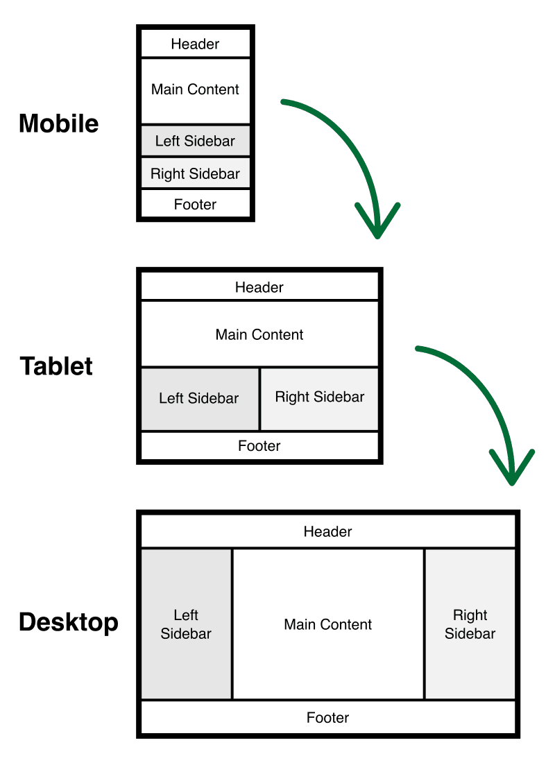
<r-c>
    <c1-1 lg1>
        Header
    </c1-1>
    <c1-1 lg1-2>
        Main Content
    </c1-1>
    <c1-1 sm1-2 lg1-4 lg2>
        Left Sidebar
    </c1-1>
    <c1-1 sm1-2 lg1-4>
        Right Sidebar
    </c1-1>
    <c1-1>
        Footer
    </c1-1>
</r-c>
Fully Responsive Layouts
35% Smaller Structural Markup Than Other Grid Systems
Don't bloat your website with verbose markup. The bytes you save by using tiny custom tags can be greater than the total size of the Responsive Columns system. The CSS is only 5.9k (minified and gzipped).
Competitor's markup
<div class="section group">
    <div class="col span_1_of_3">
        1
    </div>
    <div class="col span_1_of_3">
        2
    </div>
    <div class="col span_1_of_3">
        3
    </div>
</div>
Our markup (35% smaller!)
<r-c>
    <c1-3>
        1
    </c1-3>
    <c1-3>
        2
    </c1-3>
    <c1-3>
        3
    </c1-3>
</r-c>
Grid or Columns, it's up to You
Grid with gutters and margin is the default layout option
I've colored the following column demos so you can see them. By default, all columns have no background.
<r-c>
    <c1-4>
        1
    </c1-4>
    <c1-4>
        2
    </c1-4>
    <c1-4>
        3
    </c1-4>
    <c1-4>
        4
    </c1-4>
</r-c>
Join columns together, if you prefer
Easily remove margins, gutters, and add padding to create seamless edge-to-edge layouts.
<r-c join>
    <c1-4>
        1
    </c1-4>
    <c1-4>
        2
    </c1-4>
    <c1-4>
        3
    </c1-4>
    <c1-4>
        4
    </c1-4>
</r-c>
8 base columns
You can increase this to any number by nesting columns.
Responsive Columns Full Documentation
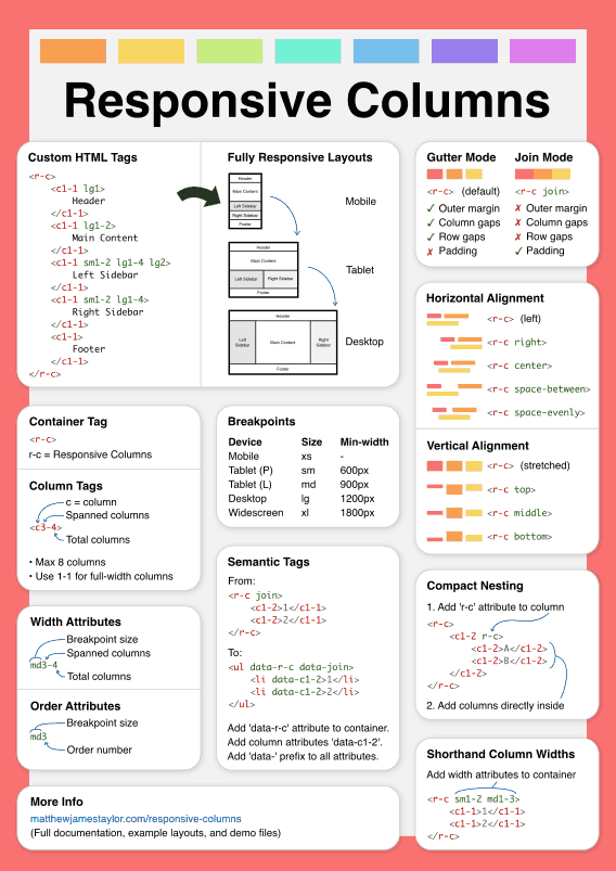
Container tag
The Responsive Column system uses tiny custom tags to make it simple, lightweight, and easy to use. The container tag is <r-c>.
'r-c' = Responsive Columns
The <r-c> container is used to group columns into sets. You can have as many columns in a set as you want.
Here's how it looks in HTML:
<r-c>
    <!-- columns go here -->
</r-c>
Hyphenated custom tags are 100% valid HTML.
(See the Mozilla Developer Website for more details on custom tags)
Column tags
There are 29 column tags in the Responsive Columns system, one for each unique column width. They use a simple naming convention so it's easy to remember.
Example column tag: <c3-5>
- 'c' = column (all column tags start with 'c')
- First number = how many columns wide
- Second number = total page columns
So the column, <c3-5> is three-fifths of the page width (spans 3 of 5 columns).
There are eight base columns, plus 21 spanned columns, this gives a total of 29 column tags:
<c1-1>
<c1-2>
<c1-3><c2-3>
<c1-4><c2-4><c3-4>
<c1-5><c2-5><c3-5><c4-5>
<c1-6><c2-6><c3-6><c4-6><c5-6>
<c1-7><c2-7><c3-7><c4-7><c5-7><c6-7>
<c1-8><c2-8><c3-8><c4-8><c5-8><c6-8><c7-8>
Here's how you add column tags to a set:
<r-c>
    <c1-3>1 of 3</c1-3>
    <c1-3>2 of 3</c1-3>
    <c1-3>3 of 3</c1-3>
</r-c>
Important notes about column tags
-
Column tags must always be the child (direct descendant) of a column set container.
-
All children of a column set container will be turned into a column by default.
-
The following tags don't exist:
<c2-2>,<c3-3>,<c4-4>,<c5-5>,<c6-6>,<c7-7>, and<c8-8>.Always use
<c1-1>for any column that spans 100%.
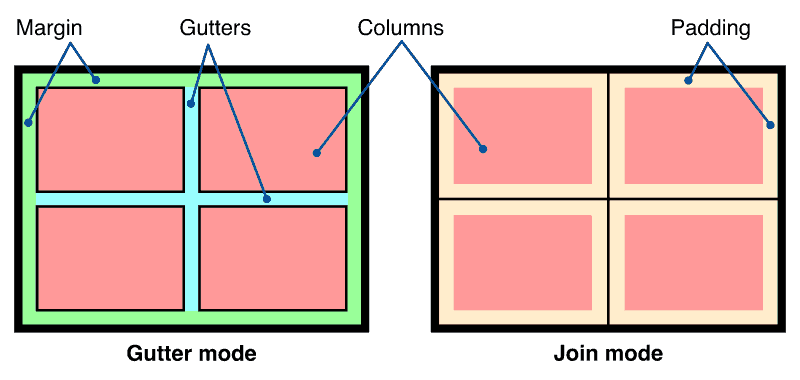
'Gutter' mode
By default, Responsive Columns are in gutter mode. Gutter mode has the following properties:
- An outer margin
- Column gaps
- Row gaps
- No padding inside columns
Here's an example: (colors added)
<r-c>
    <c1-2>1</c1-2>
    <c1-2>2</c1-2>
    <c1-2>3</c1-2>
    <c1-2>4</c1-2>
</r-c>
'Join' mode
Switch to join mode by adding the join attribute to the column set container. Join mode has the following properties:
- No outer margin
- No column gaps
- No row gaps
- Padding inside columns
Here's an example: (colors added)
<r-c join>
    <c1-2>1</c1-2>
    <c1-2>2</c1-2>
    <c1-2>3</c1-2>
    <c1-2>4</c1-2>
</r-c>- Custom attributes are 100% valid HTML when used with custom tags.
Attributes don't always need a value
Attributes that don't have a value are called boolean attributes. For example, you might already be familiar with the checked boolean attribute on form inputs:
<input checked type="radio" name="test" value="1">Layout dimensions
Layouts using Responsive Columns consist of margins, gutters, and columns with padding.
By default, all white-space elements (margins, gutters, and padding) are given the same magic dimension to make them responsive:
calc(8px + 1.5625vw)
This formula automatically increases spacing based on the available screen width. As your screen gets larger, your margins, gutters, and padding will smoothly grow to perfectly balance the available screen real estate. The same formula works horizontally and vertically.
At critical screen resolutions the white-space dimension calculates to optimal pixel-widths that are easy to remember:
| Screen width | White space width |
|---|---|
| 320px (eg: iPhone 4 & 5) | 13px |
| 360px (eg: Galaxy S5) | 14px |
| 375px (eg: iPhone 6, 7, & 8) | 15px |
| 480px | 16px |
| 768px (eg: iPad portrait) | 20px |
| 1024px (eg: iPad landscape) | 24px |
| 1280px | 28px |
| 1536px | 32px |
| 1920px | 38px |
| 2560px | 48px |
Want to know more about responsive whitespace? Check out my article: Responsive padding for all the details.
As a side note, you can use a similar formular to make your font size responsive.
calc(15px + 0.390625vw)
This calculates out to the following font sizes at common screen resolutions:
| Screen width | Font size |
|---|---|
| 320px (eg: iPhone 4 & 5) | 16px |
| 768px (eg: iPad portrait) | 18px |
| 1024px (eg: iPad landscape) | 19px |
| 1280px | 20px |
| 1536px | 21px |
| 1920px | 23px |
| 2560px | 25px |
For more details about this method, read my article: Responsive Font Size
Wrapping columns
Columns automatically wrap to multiple rows if they add up to more than 100% of the available width.
You can use column wrapping to create multi-row layouts with a single set of columns:
<r-c join>
    <c1-1>Header</c1-1>
    <c2-3>Main</c2-3>
    <c1-3>Right</c1-3>
    <c1-1>Footer</c1-1>
</r-c>
Horizontally aligning columns
If a row of columns adds up to less than 100% of the available width, there will be a gap on the right side. We can change where this gap appears by horizontally aligning the columns. This is done by adding an alignment attribute to the column set container.
There are five horizontal alignment options:
Left aligned
This is the default alignment:
<r-c>
    <c2-6><br></c2-6>
    <c1-2><br></c1-2>
    <c3-5><br></c3-5>
</r-c>
Right aligned
Use the right attribute:
<r-c right>
    <c2-6><br></c2-6>
    <c1-2><br></c1-2>
    <c3-5><br></c3-5>
</r-c>
Centered
Use the center attribute:
<r-c center>
    <c2-6><br></c2-6>
    <c1-2><br></c1-2>
    <c3-5><br></c3-5>
</r-c>
Space between
Use the space-between attribute:
<r-c space-between>
    <c2-6><br></c2-6>
    <c1-2><br></c1-2>
    <c3-5><br></c3-5>
</r-c>
Spaced evenly
Use the space-evenly attribute:
<r-c space-evenly>
    <c2-6><br></c2-6>
    <c1-2><br></c1-2>
    <c3-5><br></c3-5>
</r-c>
Horizontal alignment notes
- If there are no gaps, horizontal alignment will not effect column positions.
- You can combine horizontal alignment options with columns sets that intentionally don't add up to 100% to create additional layout options.
Vertically aligning columns
When columns in a single row have different content heights, we can align them vertically. This is done by adding a vertical alignment attribute to the column set container. There are four options:
Stretched
This is the default vertical alignment, all columns are forced to become the height of the tallest column per row:
B
C
B
<r-c>
    <c1-3>A</c1-3>
    <c1-3>A<br>B<br>C</c1-3>
    <c1-3>A<br>B</c1-3>
</r-c>
Top
Use the top attribute:
B
C
B
<r-c top>
    <c1-3>A</c1-3>
    <c1-3>A<br>B<br>C</c1-3>
    <c1-3>A<br>B</c1-3>
</r-c>
Middle
Use the middle attribute:
B
C
B
<r-c middle>
    <c1-3>A</c1-3>
    <c1-3>A<br>B<br>C</c1-3>
    <c1-3>A<br>B</c1-3>
</r-c>
Bottom
Use the bottom attribute:
B
C
B
<r-c bottom>
    <c1-3>A</c1-3>
    <c1-3>A<br>B<br>C</c1-3>
    <c1-3>A<br>B</c1-3>
</r-c>
Vertical alignment notes
- If all columns in a row have the same height content, vertical alignment will have no effect.
Stacking columns
Complex layouts don't have to be made in a single piece.
Rather than using one giant set of columns, you can break up your layout into manageable sets of columns that are stacked together vertically.
Here's an example of a layout made from three column stacks:
<!-- First stack -->
<r-c>
    <c1-4>
        Logo
    </c1-4>
    <c3-4>
        Menu
    </c3-4>
</r-c>

<!-- Second stack -->
<r-c>
    <c1-4>
        Left column
    </c1-1>
    <c2-4>
        Main column
    </c1-1>
    <c1-4>
        Right column
    </c1-1>
</r-c>

<!-- Third stack -->
<r-c>
    <c1-1>
        Footer
    </c1-1>
</r-c>
Nesting columns
Responsive Columns are compatible with nesting. Nesting is when you put sets of columns inside other columns.
Here's an example:
Left column
Right column
<r-c join>
    <c1-2>
        <p>Left column</p>
        <r-c join>
            <c1-2>1</c1-2>
            <c1-2>2</c1-2>
        </r-c>
    </c1-2>
    <c1-2>
        <p>Right column</p>
        <r-c join>
            <c1-2>A</c1-2>
            <c1-2>B</c1-2>
        </r-c>
    </c1-2>
</r-c>
You can nest columns as deep as you want.
Compact nesting
Compact nesting is when a column tag is also a column set container. By converting a column into a container you eliminate the need for an additional column set container, you add columns directly inside the column tag.
To convert a column into a container, just add the r-c attribute:
<r-c>
    <c1-2>1</c1-2>
    <c1-2 r-c>
        <c1-2>A</c1-2>
        <c1-2>B</c1-2>
        <c1-2>C</c1-2>
        <c1-2>D</c1-2>
    </c1-2>
    <c1-2>3</c1-2>
    <c1-2>4</c1-2>
</r-c>
You can easily create advanced layouts with simple nesting of columns.
Here's another example.
By nesting 6 columns in two side-by-side columns we create a 12 column grid: (rotate to landscape mode if you're on a mobile to see all 12 columns in a single row)
<r-c>
    <c1-1 sm1-2 r-c>
        <c1-6><br></c1-6>
        <c1-6><br></c1-6>
        <c1-6><br></c1-6>
        <c1-6><br></c1-6>
        <c1-6><br></c1-6>
        <c1-6><br></c1-6>
    </c1-1>
    <c1-1 sm1-2 r-c>
        <c1-6><br></c1-6>
        <c1-6><br></c1-6>
        <c1-6><br></c1-6>
        <c1-6><br></c1-6>
        <c1-6><br></c1-6>
        <c1-6><br></c1-6>
    </c1-1>
</r-c>
Breakpoints
In responsive design, a breakpoint is a 'point' where the layout adapts to changing conditions. Most commonly, breakpoints are set to specific screen widths.
The Responsive Columns system uses five standard breakpoints; extra-small, small, medium, large, and extra-large. Those sizes correspond to; mobile, tablet portrait, tablet landscape, desktop, and widescreen.
| Size | Min-width | Max-width |
|---|---|---|
| Extra-small (mobile) | (no min set) | 599px |
| Small (tablet portrait) | 600px | 899px |
| Medium (tablet-landscape) | 900px | 1199px |
| Large (desktop) | 1200px | 1799px |
| Extra-Large (widescreen) | 1800px | (no max set) |
Each breakpoint is referred to by the standard two-letter size notation that you already know:
- xs = extra-small
- sm = small
- md = medium
- lg = large
- xl = extra-large
How to make columns responsive
By default, columns don't respond to breakpoints (they remain their specified width for all breakpoints). To change a column's width at a particular breakpoint, we add a width attribute.
Width attributes come in small, medium, large, and extra-large sizes. They are specified by the letters 'sm', 'md', 'lg', and 'xl' respectively.
Note: There are no extra-small width attributes because all columns start extra-small by default.
Example width attribute: md1-2
- Two-letter size = breakpoint size (sm = small, md = medium, lg = large, xl = extra-large)
- First number = spanned columns
- Last number = total page columns
So at the medium breakpoint, md1-2 is one-half of the available width (spans 1 of 2 columns).
Here's the HTML of a column tag with small, medium, large, and extra-large width attributes added:
<c1-1 sm1-2 md1-3 lg1-4 xl1-5>...</c1-1>This column will be:
- Full-width on extra-small screens (c1-1)
- Half-width on small screens (sm1-2)
- One-third-width on medium screens (md1-3)
- One-quarter-width on large screens (lg1-4)
- One-fifth-width on extra-large screens (xl1-5)
Example responsive layout
Here's a responsive layout using width attributes to specify breakpoints: (change the size of your browser window to see the layout adjust)
<r-c join>
    <c1-1>
        Header
    </c1-1>
    <c1-1 md2-3>
        Main column
    </c1-1>
    <c1-1 md1-3>
        Side column
    </c1-1>
    <c1-1>
        Footer
    </c1-1>
</r-c>
Responsive column notes
- Column sizes automatically cascade to larger breakpoints (eg: a column will stay the size you specify for larger breakpoints unless you override it. This keeps your markup clean.)
Reordering columns
Up to 8 columns within a column set can be reordered. To reorder a column, add an order attribute like this: md1. Order attributes consist of a two-letter size, followed by a single-digit order number.
- Two-letter size specifys the breakpoint (xs = extra-small, sm = small, md = medium, lg = large, xl = extra-large)
- Single-digit order number (numbers 1 - 8 only)
For example, a column with the md1 attribute will be reordered to the first position at the medium breakpoint.
Column ordering rules
- It's only possible to move a column to positions 1 - 8 (eg: there is no attribute to move a column to position 21.)
- Reordered columns always come before all non-reordered columns (despite what order they are given.)
- All positions must be specified from 1 to the highest order number used (eg: to move a column to position 3, you must also specify the order of columns 1 and 2. See rule #2.)
Why reorder a column?
There are two main reasons why column reordering is sometimes necessary:
- Columns need to move to a particular position to make a layout work.
- You want the HTML of your most important content to come before any less important content in the source of your page (this is good for accessibility and SEO.)
Column reordering example
Below is a typical layout that many people want to use:
On mobile and tablet the main content comes first, but on a desktop, the main content comes after Col1.
We can move Col1 to the first position at the medium breakpoint by adding the md1 attribute. Col1 will stay first at the large and extra-large breakpoints because column orders automatically cascade to larger breakpoints.
Here's a working example: (resize your browser window to see the column reordering in action)
<r-c join>
    <c1-1 md1-2>
        Main
    </c1-1>
    <c1-1 sm1-2 md1-4 md1>
        Col1
    </c1-1>
    <c1-1 sm1-2 md1-4>
        Col2
    </c1-1>
</r-c>
Source ordering example
In this example, the main column comes after the side column but it's HTML is first in the page source.
<r-c join>
    <c2-3>Main column</c2-3>
    <c1-3 xs1>Side column</c1-3>
</r-c>
Putting your main HTML first is good for accessibility and SEO.
Column reordering notes
- Column order automatically cascades to larger breakpoints (eg: once you set an order for a column, it will stay at that position for all larger breakpoints unless you override it.)
Shorthand column widths
It can look messy to repeat the same width attributes for an identical set of columns. Instead of repeating yourself, move the width attributes to the column set container so they are only listed once.
- Instead of this:
<r-c>
    <c1-1 sm1-2 md1-3 lg1-4 xl1-5>1</c1-1>
    <c1-1 sm1-2 md1-3 lg1-4 xl1-5>2</c1-1>
    <c1-1 sm1-2 md1-3 lg1-4 xl1-5>3</c1-1>
    <c1-1 sm1-2 md1-3 lg1-4 xl1-5>4</c1-1>
    <c1-1 sm1-2 md1-3 lg1-4 xl1-5>5</c1-1>
    <c1-1 sm1-2 md1-3 lg1-4 xl1-5>6</c1-1>
</r-c>- Do this:
<r-c sm1-2 md1-3 lg1-4 xl1-5>
    <c1-1>1</c1-1>
    <c1-1>2</c1-1>
    <c1-1>3</c1-1>
    <c1-1>4</c1-1>
    <c1-1>5</c1-1>
    <c1-1>6</c1-1>
</r-c>
Shorthand column width notes
- You can't override shorthand column widths so only use them on identical columns.
- You can't set shorthand column widths on nested columns that are also a column set container, this is because their width attributes will clash with their children's width attributes.
Semantic HTML tags
The Responsive Columns system encourages semantic HTML use.
As an alternative to the <r-c> custom tag, you can turn any standard HTML tag into a column set container by adding the data-r-c attribute.
Here's what that looks like:
<main data-r-c>
    <!-- columns go here -->
</main>
Child tags of a column set container automatically become a full-width column (<c1-1>) but you can change the default width by adding a column attribute, eg: data-c1-2.
- Change the two numbers in the column attribute to correctly size your column at the initial extra-small breakpoint.
Semantic tag attributes must be prefixed with 'data-'
- Custom attributes are not valid on standard HTML tags, but we are allowed to use data attributes.
- You can use all the same attributes that custom tags use, just prefix them with 'data-'.
(Refer to the complete list of attributes used in the Responsive Columns system.)
Here are two examples of using semantic HTML with Responsive Columns:
Responsive and semantic HTML5 page
<main data-r-c>
    <header>
        Header
    </header>
    <section data-lg1-3>
        Section 1
    </section>
    <section data-md1-2 data-lg1-3>
        Section 2
    </section>
    <aside data-md1-2 data-lg1-3>
        Aside
    </aside>
    <footer>
        Footer
    </footer>
</main>
Note: the header and footer don't need any column attributes because columns are full-width by default.
Responsive and semantic lists
<ul data-r-c data-c1-2 data-md1-4 data-lg1-4>
    <li>
        1
    </li>
    <li>
        2
    </li>
    <li>
        3
    </li>
    <li>
        4
    </li>
    <li>
        5
    </li>
</ul>
Note: for semantic lists to display correctly, you need to remove the default list styles. See an example of responsive lists in the customizing responsive columns section below.
Download the free poster!
Print out this handy poster and place it next to your computer so you can easily refer to it while coding. It lists all the tags and attributes and shows examples of how they're used.
Download Poster
(responsive-columns-poster.pdf 80k)
Customizing Responsive Columns
There are two main ways you can customize Responsive Columns to your exact needs; writing extra CSS, or editing the core Responsive Columns CSS.
Option 1. Writing extra CSS (recommended)
To change the style of containers or columns, just add a class to them, then write some extra styles for that class.
You might find it useful to add the following CSS classes to gain finer control of margins and padding:
/* Container margins */
.margin {
    margin:calc(8px + 1.5625vw);
}
.no-margin {
    margin:0;
}
.no-margin-sides {
    margin-left:0;
    margin-right:0;
}

/* Column padding */
.padding {
    padding:calc(8px + 1.5625vw);
}
.no-padding {
    padding:0;
}
Here are some more advanced customization examples:
Responsive grid of images

In the HTML we add a class of 'image-grid' to the column set container:
<r-c join c1-2 sm1-3 md1-4 class="image-grid">
    <figure>
        <img src="https://cdn.matthewjamestaylor.com/img/fractal-brush-strokes-small.jpg" width="300" height="225" alt="Brush strokes fractal image">
    </figure>
    <!-- include as many images as you need -->
</r-c>
And then write the styles for the 'image-grid' class. Here's the CSS:
.image-grid figure {
    margin:0;
    padding:0;
}
.image-grid img {
    display:block;
    width:100%;
    height:auto;
}
Responsive cards
In this example, I turn a simple list into a set of responsive cards:
-
Card #1
-
Card #2
-
Card #3
-
Card #4
Here's the HTML: (notice the 'special-cards' class)
<ul data-r-c data-sm1-2 data-md1-3 data-lg1-4 class="special-cards">
    <li>
        Card #1<br><br><br><br>
    </li>
    <li>
        Card #2<br><br><br><br>
    </li>
    <li>
        Card #3<br><br><br><br>
    </li>
    <li>
        Card #4<br><br><br><br>
    </li>
</ul>
And here's the CSS:
.special-cards { /* container */
    list-style:none; /* remove default list styles */
    margin:0;
    padding:calc(8px + 1.5625vw);
    text-align:center;
    background:linear-gradient(0deg, #63d4ff 0%, #2490ff 100%);
}
.special-cards > * { /* columns */
    background:#fff;
    background:linear-gradient(0deg, #fff 0%, #f1f1f1 100%);
    border-top:1px solid #fff;
    border-bottom:1px solid #999;
    border-radius:3px;
    box-shadow:0 0 10px rgba(0, 0, 0, 0.2);
}
Want more layout demos? Check out my example page layouts and column sets that have multiple layout variations and special designs:
Full page layouts
Column sets
- 1 column layouts
- 2 column layouts
- 3 column layouts
- 4 column layouts
- 5 column layouts
- 6 column layouts
- 7 column layouts
- 8 column layouts
Option 2. Editing the core Responsive Columns CSS
If you need to update the default gutter width, add support for extra columns, or if you just want to tinker with the main structure of the system, then you can edit the core Responsive Columns CSS. This is obviously for advanced (or curious) users only.
Download the demo files and start editing.
Have you created something interesting? Tell me, I want to know! =)
Attributes list
Here's a complete list of attributes used in the Responsive Columns system:
| Custom tag attribute | Standard tag attribute |
|---|---|
r-c |
data-r-c |
join |
data-join |
right |
data-right |
center |
data-center |
space-between |
data-space-between |
space-evenly |
data-space-evenly |
top |
data-top |
middle |
data-middle |
bottom |
data-bottom |
c1-1 - c7-8 |
data-c1-1 - data-c7-8 |
sm1-1 - sm7-8 |
data-sm1-1 - data-sm7-8 |
md1-1 - md7-8 |
data-md1-1 - data-md7-8 |
lg1-1 - lg7-8 |
data-lg1-1 - data-lg7-8 |
xl1-1 - xl7-8 |
data-xl1-1 - data-xl7-8 |
xs1 - xs8 |
data-xs1 - data-xs8 |
sm1 - sm8 |
data-sm1 - data-sm8 |
md1 - md8 |
data-md1 - data-md8 |
lg1 - lg8 |
data-lg1 - data-lg8 |
xl1 - xl8 |
data-xl1 - data-xl8 |
Browser support
Responsive Columns works in all modern browsers, plus all old browsers that support Flexbox:
- Google Chrome 29+
- Mozilla Firefox 28+
- Microsoft Edge 12+
- Apple Safari 9+
- Opera 17+
- Android Browser 4.4+
- Opera Mobile 12.1+
- Chrome for Android
- Firefox for Android
- Opera Mini
If you find any browser-specific bugs, please let me know.
FAQs
Why do Responsive Columns use attributes instead of classes?
There are three reasons why attributes are better than classes for a layout system:
Reason 1. Custom attributes use fewer bytes
class=""is 8 characters (8 bytes) before you even specify anything!- Even 'data-' on standard elements is only 5 characters (5 bytes).
- Custom attributes use the smallest amount of bytes possible, just the ones needed for the attribute names.
It might not sound like a big difference, but saving a few characters can add up to a lot over a large website.
Reason 2. Better separation between structure and design
I like to use custom tags with custom attributes for the structural elements of a layout, I save classes for cosmetic changes on top.
Also, by using attributes, you're not littering your markup with classes everywhere. The classes you do have are just the ones needed for specific design customizations.
Reason 3. Simpler to use
Let's face it, center is easier than class="center". Simple attributes mean fewer mistakes and rapid development.
Why are there no column-offset options in Responsive Columns?
Many responsive grid frameworks have an offset feature that allows you to skip columns and leave gaps, but Responsive Columns doesn't have this feature. There are two main reasons why:
Offsets are rarely used
I've been building websites for over 24 years and I've never used a column offset. Chances are, you've hardly used them too. Because offsets are a rarely used feature, it's not worth making the whole Responsive Columns system bigger for only a few people that might want it.
You can easily create an offset in other ways
- Use horizontal alignment instead: (horizontal alignment options)
- Use nested columns instead: (nesting columns)
- Write custom CSS for specific requirements (Customizing Responsive Columns)
- Use empty columns as spacers (This is completely valid HTML, for more info see my article: Empty HTML Tags (21 Weird Things You Need To Know!)
Feedback
Have you found a bug, or have a feature request? Let me know.
If you're using Responsive Columns in production, then I'd like to know, I may showcase your website here.
Download the Demo Files
Download
(responsive-columns.zip 155k)


 Web design
 Architecture
 Life drawing
 Art gallery
 Synesthesia
 Comics