Equal-Height Columns (CSS Grid, Flexbox, Floated Containers, & Table Methods)
3 Nov 2025

Table of contents
My original equal-height columns method (floated containers) dates back to October 2008 and it still works perfectly today.
However.
A lot of new CSS has become available in modern browsers recently and this opens up simpler methods of achieving the same result.
In this article, I will cover all of the reliable equal-height column methods, show their pros and cons, and explain when it's best to use each one.
Let’s start with the problem we are trying to solve.
The Problem With Equal Height Columns
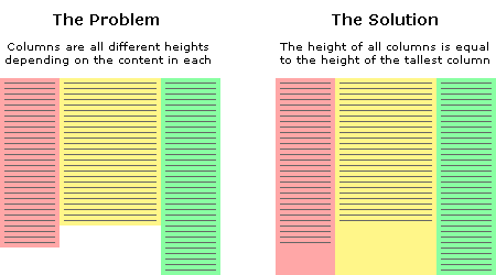
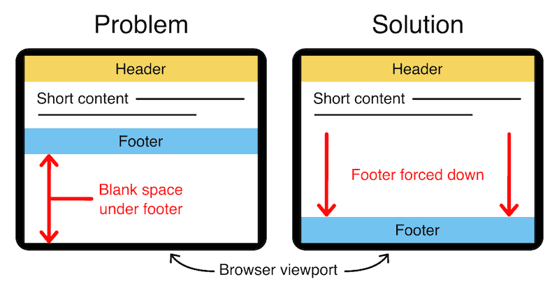
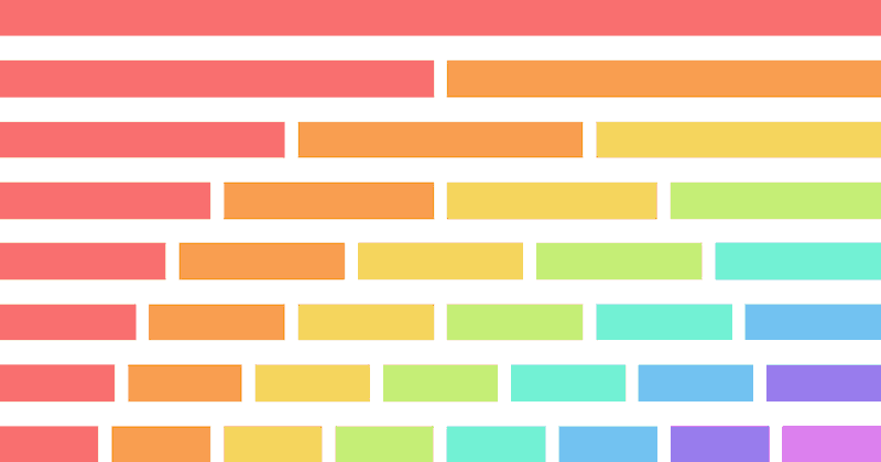
In the example above, we have three columns each with a different amount of content. You will notice that the issue is the column background colors are only as long as the content they contain. This is the problem we are trying to solve.
How can we make all columns the same height? Or more specifically, how can we make all columns the same height as the tallest column?
This is a tricky thing to do because we will never know exactly how high each column will be or which one will be the longest.
We can't simply give all columns an arbitrary height either, as this will cause big spaces at the end of the columns if there is only minimal content, and if there is too much content, then the columns will end before the content does. Neither of these situations is desirable.
The fact is, content length is dynamic so the heights of each column must also be dynamic.
We must remember that nothing is 'fixed' on the web, people have different screen resolutions and the text in their browsers can be set to any size, all of these things can affect the height of each column's content.
The Six Best Methods To Create Equal-Height Columns
In modern browsers, equal-height columns are easy to achieve with a set of CSS grid columns or a row of flexbox containers. If your target browsers don't support these features, you can use the floated-container method, display-table method, or even tables for the greatest browser support possible.
I will cover each of these in detail.
Not only will I show the features and benefits of each method but I will list the supported browsers so you can make an informed decision as to which one is the most suitable for your website's audience.
Let's start with the most modern approach and work our way back in time.
Method 1. CSS Grid — Equal-Height Columns
To make equal-height columns with CSS grid, set all grid items in a row to the height of the tallest column with the grid-auto-rows: 1fr; rule. To make columns all the same width, use the grid-template-columns: 1fr 1fr 1fr; rule and use the same number of fractional values as the number of columns.
Live demo:
B
C
B
The HTML structure:
<div class="grid">
    <div>A</div>
    <div>A<br>B<br>C</div>
    <div>A<br>B</div>
</div>
The CSS rules:
.grid {
    display: grid;
    grid-auto-rows: 1fr;
    grid-template-columns: 1fr 1fr 1fr;
}
/* The following CSS is for background colors only */
.grid > div:nth-child(1) {
    background-color: #f97171;
}
.grid > div:nth-child(2) {
    background-color: #f99e50;
}
.grid > div:nth-child(3) {
    background-color: #f5d55f;
}
Pros with CSS grid
- If you're already using CSS grid to structure your layouts then this method will work seamlessly with your current code.
Cons with CSS grid
- This method is a little trickier and slightly more verbose than the flexbox method below.
- CSS grid is a relatively new feature so it has the least browser support of all the methods in this list.
Browser support
This method will only work in browsers that support the CSS grid syntax:
- Microsoft Internet Explorer Not Supported
- Microsoft Edge 16+
- Firefox 52+
- Google Chrome 57+
- Apple Safari 10.1+
- Opera 44+
- Apple Safari (iOS) 10.3+
- Android browser 99+
For a complete list of supported browsers see can I use CSS grid.
Method 2. Flexbox — Equal-Height Columns
It's easy to make equal-height columns with flexbox because flex items automatically stretch to the height of the tallest item by default. Simply use a container set to display-flex and add any number of child elements, these will each become equal-height columns.
Live demo:
B
C
B
The HTML structure:
<div class="flex">
    <div>A</div>
    <div>A<br>B<br>C</div>
    <div>A<br>B</div>
</div>
The CSS rules:
.flex {
    display: flex;
}
.flex > div {
    width: calc(100%/3); /* Setting the width of columns at one third each */
}
/* The following CSS is for background colors only */
.flex > div:nth-child(1) {
    background-color: #f97171;
}
.flex > div:nth-child(2) {
    background-color: #f99e50;
}
.flex > div:nth-child(3) {
    background-color: #f5d55f;
}
Pros with flexbox
- Flexbox is the simplest solution to equal-height columns because flex items automatically stretch to the height of the tallest item.
- This method has better browser support than the CSS grid method.
Cons with flexbox
- Flexbox is not supported on older browsers.
Browser support
This method will only work in browsers that support the flexbox syntax:
- Microsoft Internet Explorer Not Supported
- Microsoft Edge 12+
- Firefox 28+
- Google Chrome 21+
- Apple Safari 6.1+
- Opera 12.1+
- Apple Safari (iOS) 7+
- Android browser 4.4+
For a complete list of supported browsers see can I use flexbox.
Method 3. Responsive Columns Layout System
If you're looking for the simplest way to achieve equal-height columns in modern browsers you may be interested in responsive columns.
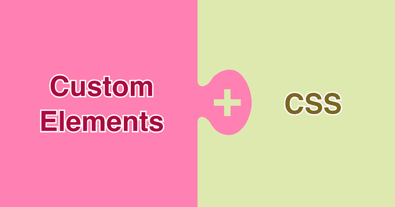
Responsive columns is a layout system that I developed that uses simple custom elements to mark up columns using pure HTML.
You can use my system to create almost any responsive layout that you can think of and equal-height columns work by default.
Live demo:
B
C
B
The HTML structure:
<r-c join class="rc">
    <c1-3>A</c1-3>
    <c1-3>A<br>B<br>C</c1-3>
    <c1-3>A<br>B</c1-3>
</r-c>
The following CSS rules are only for the background colors, the structure is handled automatically by the responsive columns system:
.rc > *:nth-child(1) {
    background-color: #f97171;
}
.rc > *:nth-child(2) {
    background-color: #f99e50;
}
.rc > *:nth-child(3) {
    background-color: #f5d55f;
}
You can learn why it's so easy and powerful here: Responsive Columns: Build Amazing Layouts With Custom HTML Tags
Pros with responsive columns
- It's responsive.
- You can create equal-height columns without writing any CSS, only HTML is required.
- Great for use in blog articles where you might not be able to provide additional styles for each post.
Cons with responsive columns
- You need to include a small snippet of CSS in your page to make it work, but it is only 5.9k (minified and gzipped).
Browser support
Because the responsive columns layout system uses flexbox under the hood, it has the same browser support as the flexbox method above.
- Microsoft Internet Explorer Not Supported
- Microsoft Edge 12+
- Firefox 28+
- Google Chrome 21+
- Apple Safari 6.1+
- Opera 12.1+
- Apple Safari (iOS) 7+
- Android browser 4.4+
See the responsive columns documentation to see all of its powerful features.
Method 4. CSS Display-Table — Equal-Height Columns
Equal-height columns can be achieved by marking up a set of divs in a container then setting their display properties in CSS to act as a table. The advantages of this method are great browser support plus it can also be made responsive so the layout fits on mobile devices.
Live demo:
B
C
B
The HTML structure:
<div class="display-table">
    <div>A</div>
    <div>A<br>B<br>C</div>
    <div>A<br>B</div>
</div>
The CSS rules:
.display-table {
    display: table;
    width: 100%;
}
.display-table > div {
    display: table-cell;
}
/* The following CSS is for background colors only */
.display-table > div:nth-child(1) {
    background-color: #f97171;
}
.display-table > div:nth-child(2) {
    background-color: #f99e50;
}
.display-table > div:nth-child(3) {
    background-color: #f5d55f;
}
And here's a responsive demo
On mobile the columns stack one on top of the other, on tablet and above they sit side-by-side.
B
C
B
The HTML structure:
<div class="display-table-responsive">
    <div>A</div>
    <div>A<br>B<br>C</div>
    <div>A<br>B</div>
</div>
The CSS rules:
.display-table-responsive {
    width: 100%;
}
.display-table-responsive > div {
    width: 100%;
}
@media (min-width:600px) {
    div.display-table-responsive {
        display: table;
        width: 100%;
    }
    .display-table-responsive > div {
        display: table-cell;
        width: auto;
    }
}
/* The following CSS is for background colors only */
.display-table-responsive > div:nth-child(1) {
    background-color: #f97171;
}
.display-table-responsive > div:nth-child(2) {
    background-color: #f99e50;
}
.display-table-responsive > div:nth-child(3) {
    background-color: #f5d55f;
}
Pros with display-table
- It has strong browser support.
- It can be made responsive.
Cons with display-table
- It's not practical to have more than two responsive breakpoints with this method.
- Because tables have a strict and rigid structure you can't manipulate cells as easily as other types of block elements.
Browser support
- Microsoft Internet Explorer 8+
- Microsoft Edge 12+
- Firefox 3+
- Google Chrome 4+
- Apple Safari 3.1+
- Opera 10+
- Apple Safari (iOS) 3.2+
- Android browser 2.1+
For a complete list of supported browsers see can I use display table.
Method 5. Floated Containers — Equal-Height Columns
This is the method that I developed in 2008 so it has excellent browser support. It works by using multiple containers that are shifted in position to reveal full-height columns.
Let's run through it step by step.
Step 1. Separate column content from its background-color
The first step to solving the equal height problem is to break it into smaller pieces that can be solved separately.
We start by using two divs for each column instead of one. The first div will be used to hold the content and the other will be used as the background color. This separation gives us individual control over these elements plus we can put them together in a more useful way.
This will all become clear shortly.
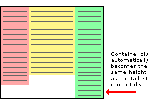
Step 2. Use a floated container div so it will always be the height of the tallest column
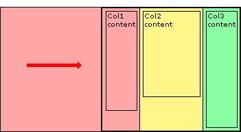
This is the central principle behind this equal column height method. The only way to make the height of a div equal to the tallest column is if that div contains all the columns. So to explain this another way, by placing the columns inside a container we cause the container to be the height of the tallest column. This is a very useful structure.
Three column HTML div structure
In the example above the three content columns are inside a container div.
<div id="container1">
    <div id="col1">Column 1</div>
    <div id="col2">Column 2</div>
    <div id="col3">Column 3</div>
</div>
Three column CSS
And here is the CSS that forces the container div to the height of the longest column.
#container1 {
    float:left;
    width:100%;
}
#col1 {
    float:left;
    width:30%;
    background:red;
}
#col2 {
    float:left;
    width:40%;
    background:yellow;
}
#col3 {
    float:left;
    width:30%;
    background:green;
}
For this structure to work correctly in all browsers the container div must be floated (left or right) plus each of the column content divs must also be floated, it does not matter which way.
The process of floating the content divs makes them line up horizontally across the page. Floating the container makes it stretch down to the height of the tallest column inside.
If we don't float the container then the content divs will stick out of the container at the bottom and the container won't have the correct height. Actually, in this example, the container will end up with a height of zero if it is not floated.
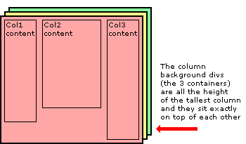
Step 3. Add extra nested containers
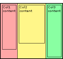
The next step to equal height columns is to add extra containers so they are nested inside each other. We need the same number of containers as we do columns - three. These three containers are going to be the backgrounds of each column.
Notice that we have removed the background colors from the original columns and added them to the containers.
Three column HTML div structure
The two extra containers have been added to the HTML below.
<div id="container3"> <!-- added -->
    <div id="container2"> <!-- added -->
        <div id="container1">
            <div id="col1">Column 1</div>
            <div id="col2">Column 2</div>
            <div id="col3">Column 3</div>
        </div>
    </div> <!-- added -->
</div> <!-- added -->
Three column CSS
All the elements are floated to the left and the containers have a width set to 100% so they stay the full width of the page. The background colors have been removed from the content divs and added to the containers.
#container3 {
float:left; /* added */
width:100%; /* added */
background:green; /* added */
}
#container2 {
float:left; /* added */
width:100%; /* added */
background:yellow; /* added */
}
#container1 {
float:left;
width:100%;
background:red;
}
#col1 {
float:left;
width:30%;
}
#col2 {
float:left;
width:40%;
}
#col3 {
float:left;
width:30%;
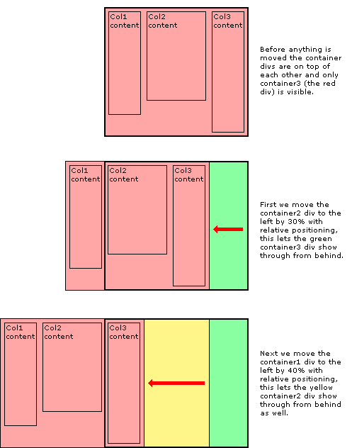
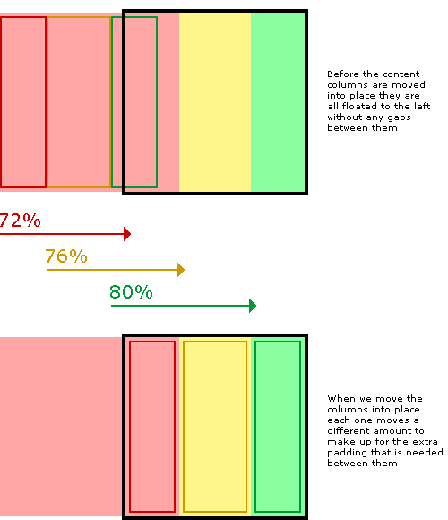
}Step 4. Move the containers into place with relative positioning
Using relative positioning we now move the containers to their new locations.
When each container is moved the divs become visible below. It is the layering and position of the colored containers that create the background of the equal height columns.
The container2 div is moved to the left by 30% to reveal the green right-hand column and the container1 div is moved to the left 40% to reveal the yellow center column and at the same time, the red section that is still visible becomes the left-hand column.
The CSS relative positioning rules
Here is the CSS showing the addition of relative positioning.
#container3 {
    float:left;
    width:100%;
    background:green;
}
#container2 {
    float:left;
    width:100%;
    background:yellow;
    position:relative; /* added */
    right:30%; /* added */
}
#container1 {
    float:left;
    width:100%;
    background:red;
    position:relative; /* added */
    right:40%; /* added */
}
#col1 {
    float:left;
    width:30%;
}
#col2 {
    float:left;
    width:40%;
}
#col3 {
    float:left;
    width:30%;
}
Step 5. Move the content back to align with each column
The next thing to do is to move the content of each column back onto the page so that it aligns with the column background color underneath. Again this is done with simple relative positioning.
And then finally we chop off the overhanging containers by adding an overflow:hidden; rule on the outermost container - container3.
The CSS relative positioning rules
Here is the CSS showing the addition of relative positioning and the overflow rule. Notice the extra position:relative; on container3, this is to solve an old Internet Explorer bug that stops the overflow:hidden; from working.
#container3 {
    float:left;
    width:100%;
    background:green;
    overflow:hidden; /* added */
    position:relative; /* added */
}
#container2 {
    float:left;
    width:100%;
    background:yellow;
    position:relative;
    right:30%;
}
#container1 {
    float:left;
    width:100%;
    background:red;
    position:relative;
    right:40%;
}
#col1 {
    float:left;
    width:30%;
    position:relative; /* added */
    left:70%; /* added */
}
#col2 {
    float:left;
    width:40%;
    position:relative; /* added */
    left:70%; /* added */
}
#col3 {
    float:left;
    width:30%;
    position:relative; /* added */
    left:70%; /* added */
}
Step 6. Add padding to the columns
The last thing to do is add padding to the columns so the text is not squashed right up against the edge of each column.
If we were to add a CSS padding rule to the columns this might work in some browsers but unfortunately not all. Old versions of Internet Explorer get the box model wrong and so it calculates the width of elements with padding differently.
A box 200 pixels wide with 20 pixels padding will be a total of 200 pixels wide in Internet Explorer but in all other browsers, it will be a correct 240 pixels wide. Padding, you see, should be 'added' to the width of an element, not taken away.
But don't worry...
We can solve this problem in a completely different way that does not rely on a padding rule.
Instead of padding, we can just make our columns narrower (the column width minus padding on both sides) and then just move them into the correct position with relative positioning.
In our example, we will use 2% padding so a column that is 30% wide will be reduced to 26% and a 40% wide column is reduced to 36%.
When we move the columns back into place with relative positioning we need to remember that the columns are now narrower so when they are initially all floated together to the left, each one has progressively further to move into place than the one before.
The completed solution
To keep the layout together at small widths I have also added an overflow:hidden; rule to each content column. This will chop off any content that is too wide for the column and stop it from interfering with the rest of the layout.
Again, this overflow is only really a problem with old versions of Internet Explorer, all other browsers will maintain the correct layout no matter what is in the columns. If you want to, try exposing this rule only to Internet Explorer with IE conditional comments.
#container3 {
    float:left;
    width:100%;
    background:green;
    overflow:hidden;
    position:relative;
}
#container2 {
    float:left;
    width:100%;
    background:yellow;
    position:relative;
    right:30%;
}
#container1 {
    float:left;
    width:100%;
    background:red;
    position:relative;
    right:40%;
}
#col1 {
    float:left;
    width:26%;
    position:relative;
    left:72%;
    overflow:hidden;
}
#col2 {
    float:left;
    width:36%;
    position:relative;
    left:76%;
    overflow:hidden;
}
#col3 {
    float:left;
    width:26%;
    position:relative;
    left:80%;
    overflow:hidden;
}
Live demos:
Check out my demo pages here: 2 columns, 3 columns, 4 columns, and 5 columns.
Pros with floated containers
- It has excellent browser support, all the way back to Internet Explorer 5.5
Cons with floated containers
- It's a complicated method that requires careful coding to get right.
- It requires extra container elements that are not required in the above methods.
- It's not responsive.
Browser support
Floated containers have excellent browser support.
- Microsoft Internet Explorer 5.5+
- Microsoft Edge 12+
- Firefox 2+
- Google Chrome 4+
- Apple Safari 3.1+
- Opera 10+
- Apple Safari (iOS) 3.2+
- Android browser 2.1+
Have a play with the CSS and see how it works for yourself. You can have as many columns as you want as long as there are the same amount of containers as content columns.
Download the Source Files
Get your own copy of the source files and experiment with the floated equal-height columns method for yourself:
Download
(equal-height-columns.zip 8kb)
Method 6. Table Markup — Equal-Height Columns
The most browser-compatible method of achieving equal-height columns is to use table markup to create a row of columns. Making columns with tables is the only reliable method in HTML emails because most email clients don't support newer CSS like CSS grid or flexbox.
Live demo:
| A | A B C |
A B |
The HTML structure:
<table class="table-columns">
    <tr>
        <td>A</td>
        <td>A<br>B<br>C</td>
        <td>A<br>B</td>
    </tr>
</table>
The CSS rules:
.table-columns {
    width: 100%;
    border: 0;
}
.table-columns td {
    vertical-align: top;
    border: 0;
}
/* The following CSS is for background colors only */
.table-columns tr > td:nth-child(1) {
    background-color: #f97171;
}
.table-columns tr  > td:nth-child(2) {
    background-color: #f99e50;
}
.table-columns tr  > td:nth-child(3) {
    background-color: #f5d55f;
}
Pros with table markup
- It has the most comprehensive browser support available.
- It's the only reliable option for HTML emails.
Cons with table markup
- It's not responsive.
- It's verbose, requiring extra
<tr>elements. - It's not semantic. Tables imply meaning by defining relationships between the rows and columns of cells but this does not actually make sense here. We're using tables, not for their intended purpose.
Browser support
Table markup is the most widely supported method of creating equal-height columns. It will work in practically all browsers you try, no matter how old.
Summary
There are many reliable ways to achieve equal-height columns in CSS, which way you choose will depend on the browsers you need to support and also your personal preference as to which method makes the most sense to you.
Happy coding! =)
Are you using <div> tags to structure your website? Please read this first: Replace Divs With Custom Elements For Superior Markup
Are you building a responsive website? You may find the following articles useful:
- Responsive Font Size (Optimal Text at Every Breakpoint)
- Responsive Padding, Margin & Gutters With CSS Calc
- Responsive Columns Layout System
- Responsive Banner Ads
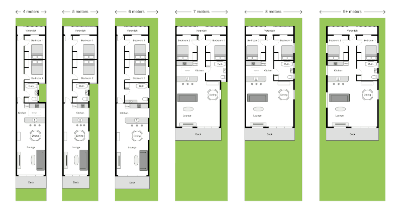
And for a bit of fun, you might like my Responsive house plan which changes layout depending on the width of the page.

Follow me on @mattjamestaylor


 Web design
 Architecture
 Life drawing
 Art gallery
 Synesthesia
 Comics