Custom Element Examples (Without Javascript)
3 Nov 2025
Table of contents
You don’t need javascript to use custom elements, they can be a useful addition to your web development toolkit with only minimal CSS.
Below are a few of my favorite custom element examples that show just how useful they are:
Unbold Subheadings With The <sub-head> Element
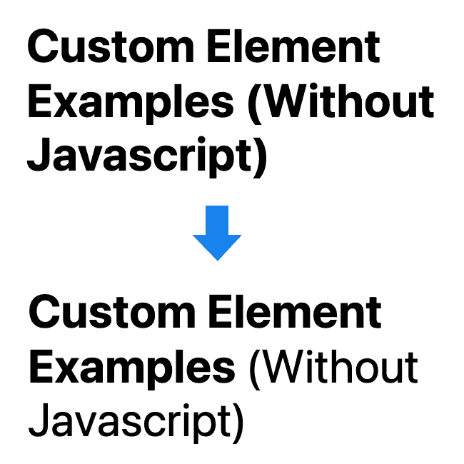
I like to run my headings and subheadings together with the subheading part unbolded. To do this, I created a custom inline element called <sub-head> and add CSS to remove the bold style.
Here's how it's done:
HTML
<h1>Custom Element Examples <sub-head>(Without Javascript)</sub-head></h1>CSS
sub-head {
    font-weight:normal;
}
Once the sub-head custom element styles are set up it's so easy to use all over the place.
Highlight Text With The <high-light> Element
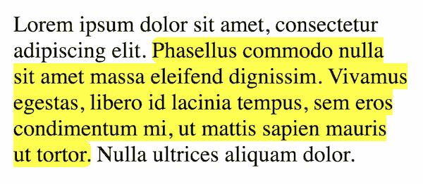
Sometimes you may want to draw attention to a fragment of text by highlighting it, you can easily do that with the <high-light> custom element.
HTML
<p>Normal text <high-light>highlighted text</high-light> more normal text.</p>CSS
high-light {
    background:rgba(255, 255, 0, .8);
    border-radius:.3em;
}
By using a semi-transparent yellow it can work on all background colors.
Prevent Line-Wrapping With The <no-wrap> Element
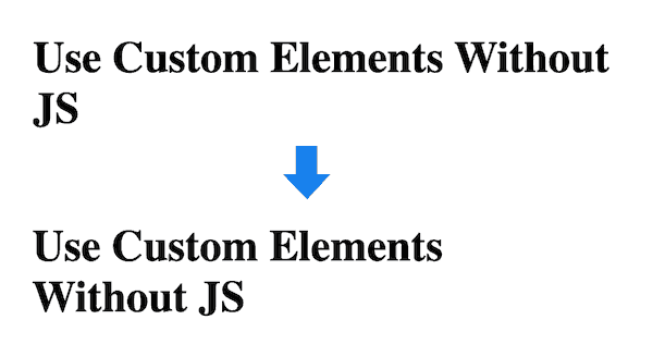
In print layouts, designers avoid one-word turnovers because they look unbalanced, we can achieve the same thing on the web with the <no-wrap> custom element.
HTML
<h1>Use Custom Elements <no-wrap>Without JS</no-wrap></h1>CSS
no-wrap {
    white-space:nowrap;
}
Now, anytime you want to avoid text from wrapping just surround it in the <no-wrap> element.
Create Spaced Out Inline Links With The <line-links> Element
If you want to show an inline list of links but need a bit more spacing for mobile users then the <line-links> custom element is a great solution.
Here's a live example:
HTML
<line-links>
    <a href="/responsive-font-size">Responsive font size</a>
    <a href="/responsive-padding">Responsive padding</a>
    <a href="/id-vs-class">ID vs Class</a>
    <a href="/equal-height-columns">Equal-height columns</a>
    <a href="/add-css-to-html">Add CSS to HTML</a>
</line-links>
CSS
line-links {
    display:flex;
    gap:1rem;
    flex-wrap:wrap;
}
line-links > a {
    white-space:nowrap;
}
Line-link blocks are perfect for menus, submenus, and footer links.
Insert Special Characters With <x-char> Elements
I often add ticks and crosses in my articles so I have created two custom elements so I can make them consistent in color and style.
Here's how they look:
HTML
<p>
    <tick-char></tick-char> Fruit & vegetables<br>
    <cross-char></cross-char> Chocolate & candy
</p>
CSS
tick-char:before {
    content: '✓';
    color:#006e37;
    font-weight:bold;
}
cross-char:before {
    content: '✗';
    color:#ec1358;
    font-weight:bold;
}
If there are particular characters that you use all the time, create a custom element for them to make your life easier.
Add Tool Tips With The <help-text> Element
Sometimes you need to provide more information where space is at a premium, the <help-text> custom element is perfect for this.
Hover or tap:
HTML
<help-text txt="Always provide useful help when possible">?</help-text>CSS
help-text {
    display:inline-block;
    width:1.5em;
    height:1.5em;
    text-align:center;
    line-height:1.5em;
    border-radius:50%;
    background:lightblue;
    font-weight:bold;
    cursor:pointer;
    position:relative;
}
help-text:hover:after,
help-text:active:after {
    content:attr(txt);
    display:block;
    width:8em;
    background:#ff9;
    padding:1rem;
    box-shadow:0 8px 16px -8px rgb(0 0 0 / 30%);
    text-align:left;
    position:absolute;
    top:2em;
    left:1em;
}
Add Columns With <two-col>, <three-col>, & <four-col> Elements
Easily divide your content into columns with the following three custom element containers.
HTML
<two-col>
    <div>1</div>
    <div>2</div>
</two-col>

<three-col>
    <section>1</section>
    <section>2</section>
    <section>3</section>
</three-col>

<four-col>
    <article>1</article>
    <article>2</article>
    <article>3</article>
    <article>4</article>
</four-col>
CSS
two-col,
three-col,
four-col {
    width:100%;
    display:flex;
    gap:2rem;
    flex-wrap:wrap;
    margin:1rem 0;
}
two-col > * {
    width:calc((100% - 2rem) / 2);
    background:#eee; /* optional */
}
three-col > * {
    width:calc((100% - 4rem) / 3);
    background:#eee; /* optional */
}
four-col > * {
    width:calc((100% - 6rem) / 4);
    background:#eee; /* optional */
}
These column tags are designed to overflow to multiple rows if you have more than the column count. This allows them to also be usable for grids of content.
The individual columns will work with any tags, eg: divs, sections, articles, or a combination so you are free to use whatever tag makes the most sense for your situation.
Are you using divs? Read this first: Replace Divs With Custom Elements For Superior Markup.
Achieve Optimal Reading Line Length With The <good-measure> Element
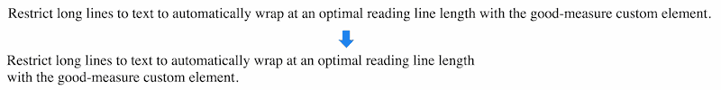
With responsive design, sometimes large layouts can end up with long line lengths of text that become difficult to read. The optimal length for reading is approximately 34em (source).
We can restrict blocks of text to a max-width of 34em with the good-measure custom element.
HTML
<good-measure>
    <p>Restrict long lines to text to automatically wrap at an optimal reading line length with the good-measure custom element.</p>
</good-measure>
CSS
good-measure {
    display:block;
    max-width:34em;
}
Image Grids With The <figure-grid> Element

Want to lay out a grid of images? Add your images to the <figure-grid> container and they will conform to a grid.
HTML
<figure-grid>
    <figure><img ... ></figure>
    <figure><img ... ></figure>
    <figure><img ... ></figure>
    <figure><img ... ></figure>
    <figure><img ... ></figure>
    <figure><img ... ></figure>
</figure-grid>
CSS
/* responsive images */
figure {
    margin:2rem 0;
    text-align:center;
}
figure img {
    max-width:100%;
    height:auto;
}

/* grid */
figure-grid {
    display:flex;
    flex-wrap:wrap;
    gap:2rem;
    justify-content:center;
    margin:2rem 0;
}
figure-grid figure {
    max-width:400px;
    margin:0;
}
This grid will automatically change the number of columns to match your page width without using media queries and breakpoints.
Responsive Columns Custom Elements
I developed a responsive layout system called Responsive Columns that uses a set of tiny custom tags and a small piece of companion CSS. With this tool, you can easily create fully responsive layouts in minutes with only HTML.
This is perfect for rapid prototyping, or layouts on production websites.
See my Responsive Columns documentation for details and examples.
Summary
There are so many simple use cases for custom elements that don't require javascript.
Feel free to use any of my favorite examples above, or invent your own.
Want to experiment with custom elements? Check out my article first: Custom HTML Tags (18 Things To Know Before Using Them).
Have you created a new and useful custom element? Let me know and I might include it here (along with credit of course).

Follow me on @mattjamestaylor


 Web design
 Architecture
 Life drawing
 Art gallery
 Synesthesia
 Comics