CSS: Horizontally Centred Menus (With Optional Dropdowns)
3 Nov 2025

Table of contents
A lot of people want centered menus on their website but for the CSS novice, this task seems almost impossible.
If you search online you will find a few centering methods but most of these rely on CSS hacks, JavaScript, or non-standard CSS rules that are not supported by all browsers.
In this post, I'm going to show you my secret method of centering a menu that does not require any CSS hacks and will work in all common web browsers back to Internet Explorer 5.5!
It's also compatible with my responsive column layouts.
Let's start with a basic example then I'll explain how it works.
Demo: Centered Menu Basic Example
Below you should see a menu of four horizontally centered tabs. The second tab is set as active so it stands out.
Try resizing your browser window and changing your text size to see how the menu always remains centered and clickable.
Of course, we could make much a nicer design but this will do for now. At the end of this article, I have some nice centered menu examples.
How To Center a Menu With CSS
Let's see how centered menus work step-by-step so you can create them for yourself.
Step 1. Understand the key principle: Floated elements shrink to the width of their contents
The trick to my centering method is how the floated elements are relatively positioned within one another. To explain this properly let me first describe how an element can change its dimensions when floated.
Non-floated div
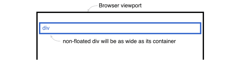
Here is a simple blue div that is not floated. Notice how it automatically stretches to 100% of the width of its containing element (the browser viewport).
Left floated div
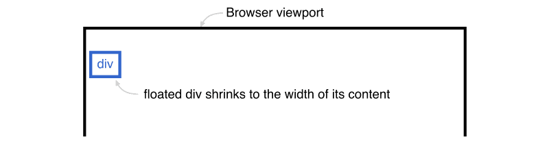
If we float the div to the left or right (it doesn't matter which direction) the div will automatically shrink to match the width of the content inside itself.
In the illustration above, the floated div is now only as wide as the text 'div' inside it. This shrinking of floated elements is the key to the centering process, it helps us move our menu the right distance to the center.
So, now we understand how floats work, let's look at the HTML structure of a centered menu
Step 2. Create the HTML structure
The HTML used for these centered menus is semantically correct and very basic. The structure is simply a list of links in a single div.
<div id="centeredmenu">
   <ul>
      <li><a href="#">One</a></li>
      <li><a href="#" class="active">Two</a></li>
      <li><a href="#">Three</a></li>
      <li><a href="#">Four</a></li>
   </ul>
</div>
Next, let's look at the CSS.
Step 3. Align your menu to the right
We start with a standard right-aligned menu:
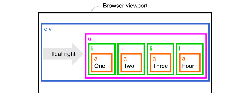
A right-aligned menu is styled in the following way:
The container (blue 'div')
The outer div is floated so it stretches down to contain the ul inside it.
To prevent the div from shrinking horizontally I added width:100%; so it stays the full width of the page.
The unordered list (magenta 'ul')
The ul is floated to the right side of the page and it shrinks to the size of the menu.
The list items (green 'li')
The li elements are all floated to the left so they line up horizontally.
The links (orange 'a')
The links are set to display:block; so the full rectangle is clickable.
Right-aligned menu done!
Let's make it centered.
Step 4. Shift the unordered list to the left (magenta 'ul')
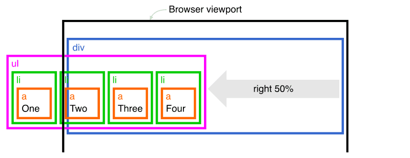
Next, we shift the ul element to the left by 50% by using position:relative; and right:50%;.
Important note: When moving an element to the side by a percentage value, the distance will be a percentage of its containing element's width, not its width. So in this instance, the ul element will move to the left by 50% of the parent div width (half of the browser viewport).
Now our menu is partly cut-off by the left of the screen, but don't worry, in one more step, we will have it in the center.
Step 5. Shift the line items to the right (green 'li')
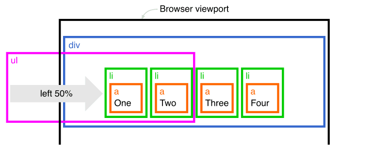
The last step is to shift the li elements back to the right by 50% with position:relative; and left:50%;. This will be 50% of the width of the parent ul element and will put the menu exactly in the center of the window.
We now have a centered menu!
Here's the completed CSS:
div#centeredmenu {
	float:left;
	width:100%;
	background:#fff;
	border-bottom:4px solid #000;
	margin-bottom:15px;
	position:relative;
	margin:1.5em 0;
}
div#centeredmenu ul {
	clear:left;
	float:right;
	list-style:none;
	margin:10px 0 0 0;
	padding:0;
	position:relative;
	right:50%;
	text-align:center;
}
div#centeredmenu ul li {
	display:block;
	float:left;
	list-style:none;
	margin:0;
	padding:0;
	position:relative;
	left:50%;
}
div#centeredmenu ul li a {
	display:block;
	margin:0 0 0 1px;
	padding:3px 10px;
	background:#ddd;
	color:#000;
	text-decoration:none;
	line-height:1.3em;
}
div#centeredmenu ul li a:hover {
	background:#369;
	color:#fff;
}
div#centeredmenu ul li a.active,
div#centeredmenu ul li a.active:hover {
	color:#fff;
	background:#000;
	font-weight:bold;
}
Some important notes
This method of centering menus is rock-solid but there are a couple of things you must be aware of.
- Because the
ulelement is not aligned with the tabs you cannot add any visible styling to it. Leave it without background color and with no border so it will be completely invisible. Do all of your styling on thediv,li, andaelements only. - If you need to style the first or last tab differently from the others you can use
li:first-child {/* css here */}andli:last-child {/* css here */}but these are not supported in old versions of Internet Explorer.
Centered Menu Examples
The following centered menus all use the same HTML markup, only their CSS is different. Download my demo files so you can play with them yourself.
Roundbar blue
Roundbar grey
boxtab blue
talltabs apple
talltabs maroon
talltabs blue
talltabs orange
talltabs black
topmetal gold
topmetal teal
topmetal pink
topmetal lilac
Centered Menu Features
No CSS hacks
The CSS used for these centered menus is 100% valid and hack-free. To overcome Internet Explorer's broken box model, no horizontal padding or margins are used. Instead, this design uses clever relative positioning.
Valid HTML markup
The HTML in these centered menus validates as XHTML 1.0 strict. But you can also use HTML5.
Resizable text compatible
These centered tabs are fully compatible with resizable text. Resizable text is important for web accessibility. People who are vision impaired can make the text larger so it's easier for them to read. It is becoming increasingly more important to make your website resizable text compatible because people are expecting higher levels of web accessibility.
No JavaScript required
JavaScript is not required. Some website layouts rely on JavaScript hacks to resize divs and force elements into place but you won't see any of that nonsense here.
Full cross-browser compatible
The pure CSS-centered menus have been tested on the following browsers.
iPhone & iPod Touch
- Safari
- Chrome
Mac
- Safari
- Firefox 2+
- Opera
Windows
- Firefox 2+
- Safari
- Opera
- Google Chrome
- Internet Explorer 5.5 and above.
Demo: Centered Menu With Dropdowns (submenus)
In the demo below you can see a centered menu, hover over the top-level menu items and a submenu will dropdown below each one.
For touch devices like iPhones and iPads, you simply tap to open each submenu. A second tap on the parent link will navigate to that URL.
Let's see how that's done...
Add Dropdowns (submenus) to your Centered Menu
Here is what the HTML structure looks like:
<div id="centeredsubmenu">
    <ul>
        <li><a href="#">One</a>
            <ul>
                <li><a href="#">Sub one</a></li>
                <li><a href="#">Sub two</a></li>
                <li><a href="#">Sub three</a></li>
                <li><a href="#">Sub four</a></li>
                <li><a href="#">Sub five</a></li>
            </ul>
        </li>
        <li class="active"><a href="#" class="active">Two</a>
            <ul>
                <li><a href="#">Sub one</a></li>
                <li><a href="#">Sub two</a></li>
                <li><a href="#">Sub three</a></li>
                <li><a href="#">Sub four</a></li>
                <li><a href="#">Sub five is a long link that wraps</a></li>
            </ul>
        </li>
        <li><a href="#">Three</a>
            <ul>
                <li><a href="#">Sub one</a></li>
                <li><a href="#">Sub two</a></li>
                <li><a href="#">Sub three</a></li>
                <li><a href="#">Sub four</a></li>
                <li><a href="#">Sub five</a></li>
            </ul>
        </li>
        <li><a href="#">Four</a>
            <ul>
                <li><a href="#">Sub one</a></li>
                <li><a href="#">Sub two</a></li>
                <li><a href="#">Sub three</a></li>
                <li><a href="#">Sub four</a></li>
                <li><a href="#">Sub five</a></li>
            </ul>
        </li>
    </ul>
</div>
As you can see, we have nested a list of links inside each of the items in the outer list. This is the most semantic way to create such a structure.
And here is the CSS that makes it all happen. I'm breezing over this a little, if you want more info please read the comments in the CSS.
div#centeredsubmenu {
    clear:both;
    float:left;
    margin:0 0 1em;
    padding:0;
    border-bottom:4px solid #000; /* black line below menu */
    width:100%;
    font-family:Verdana, Geneva, sans-serif; /* Menu font */
    font-size:90%; /* Menu text size */
    z-index:10; /* This makes the dropdown menus appear above the page content below */
    position:relative;
 }

 /* Top menu items */
 div#centeredsubmenu ul {
    margin:0;
    padding:0;
    list-style:none;
    float:right;
    position:relative;
    right:50%;
 }
 div#centeredsubmenu > ul > li {
    margin:0 0 0 1px;
    padding:0;
    float:left;
    position:relative;
    left:50%;
    top:1px;
 }
 div#centeredsubmenu > ul > li a {
    display:block;
    margin:0;
    padding:.6em .5em .4em;
    font-size:1em;
    line-height:1em;
    background:#ddd;
    text-decoration:none;
    color:#444;
    font-weight:bold;
    border-bottom:1px solid #000;
 }
 div#centeredsubmenu > ul > li.active a {
    color:#fff;
    background:#000;
 }
 div#centeredsubmenu > ul > li a:hover {
    background:#36f; /* Top menu items background colour */
    color:#fff;
    border-bottom:1px solid #03f;
 }
 div#centeredsubmenu > ul > li:hover a { /* This line is required for IE 6 and below */
    background:#36f; /* Top menu items background colour */
    color:#fff;
    border-bottom:1px solid #03f;
 }

 /* Submenu items */
 div#centeredsubmenu ul ul {
    display:none; /* Sub menus are hidden by default */
    position:absolute;
    top:2em;
    left:0;
    width:10em; /* width of the drop-down menus */
 }
 div#centeredsubmenu ul ul li {
    clear:left;
    width:100%;
 }
 div#centeredsubmenu ul ul li a,
 div#centeredsubmenu ul li.active li a,
 div#centeredsubmenu ul li:hover ul li a { /* This line is required for IE 6 and below */
    font-size:.8em;
    font-weight:normal; /* resets the bold set for the top level menu items */
    background:#eee;
    color:#444;
    line-height:1.4em; /* overwrite line-height value from top menu */
    border-bottom:1px solid #ddd; /* sub menu item horizontal lines */
 }
 div#centeredsubmenu ul ul li a:hover,
 div#centeredsubmenu ul li.active ul li a:hover,
 div#centeredsubmenu ul li:hover ul li a:hover { /* This line is required for IE 6 and below */
    background:#36f; /* Sub menu items background colour */
    color:#fff;
 }

 /* Flip the last submenu so it stays within the page */
 div#centeredsubmenu ul li:last-child ul {
    left:auto; /* reset left:0; value */
    right:0; /* Set right value instead */
 }

 /* Make the sub menus appear on hover */
 div#centeredsubmenu ul li:hover ul { /* This line is required for IE 6 and below */
    display:block; /* Show the sub menus */
 }
Flipping the last sub-menu
As a nice little extra, I have flipped the last menu item to prevent it from extending off the page. To do this, I use li:last-child ul to target the last submenu ul element.
Free Download
Download my demo files and have a closer look at how centered menus work.
Download
(css-centered-menus.zip 4kb)

Follow me on @mattjamestaylor


 Web design
 Architecture
 Life drawing
 Art gallery
 Synesthesia
 Comics