

Read more of my web design articles:
Responsive Attributes: Generate CSS Grid Layouts With Simple HTML
5 Feb 2024
5 Feb 2024
Less than 1kb of CSS! (minified and gzipped) Free Download
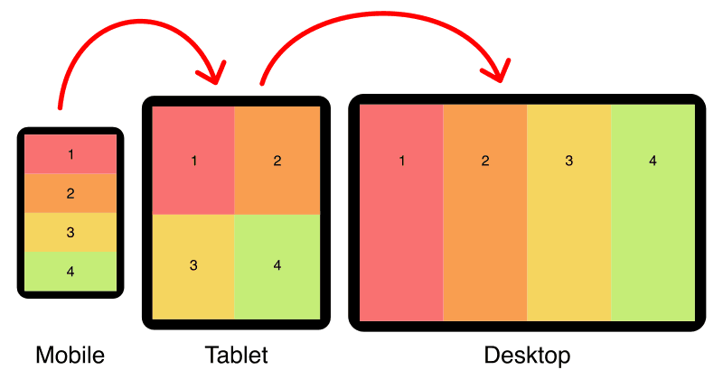
Responsive Attributes uses three standard breakpoints; small (sm), medium (md), and large (lg). These sizes correspond to; mobile, tablet, and desktop devices.
| Size | Min-width | Max-width |
|---|---|---|
| Small (mobile) | (no min) | 767px |
| Medium (tablet) | 768px | 1023px |
| Large (desktop) | 1024px | (no max) |
Breakpoints are easy to customize. Download the source CSS and edit the breakpoint values.
On the grid container, add your rules as a space-separated list inside the data-attribute for each breakpoint:
<div
    data-sm="<!-- mobile rules here -->"
    data-md="<!-- tablet rules here -->"
    data-lg="<!-- desktop rules here -->"
    >
    <!-- columns here -->
</div>Columns automatically wrap to multiple lines if the number of columns per row is exceeded.
<div data-sm="2column">
    <div>1</div>
    <div>2</div>
    <div>3</div>
    <div>4</div>
</div>Change the order of columns with the order rules (order1 — order8). In the example above, column 2 has been moved first.
<div data-sm="2column">
    <div>1</div>
    <div data-sm="order1">2</div>
    <div>3</div>
    <div>4</div>
</div>Span columns with the colspan rule (colspan1 — colspan8).
<div data-sm="2column">
    <div data-sm="colspan2">A</div>
    <div>B</div>
    <div>C</div>
</div>Span rows with the rowspan rule (rowspan1 — rowspan8).
<div data-sm="2column">
    <div data-sm="rowpan2">A</div>
    <div>B</div>
    <div>C</div>
</div>Put sets of columns inside other columns to any depth you need, this is called nesting. Nesting is an excellent way to create advanced layouts, for example; creating more than 8 columns.
<div data-sm="2column">
    <div data-sm="2column">
        <div>1A</div>
        <div>1B</div>
        <div>1C</div>
        <div>1D</div>
    </div>
    <div>2</div>
    <div>3</div>
    <div>4</div>
</div>Build up advanced layouts by stacking column sets on top of one another.
<!-- first stack -->
<div data-sm="2column">
    <div>1</div>
    <div>2</div>
</div>

<!-- second stack -->
<div data-sm="3column">
    <div>A</div>
    <div>B</div>
    <div>C</div>
</div>

<!-- third stack -->
<div data-sm="4column">
    <div>i</div>
    <div>ii</div>
    <div>iii</div>
    <div>iv</div>
</div>Add horizontal and vertical gaps between your columns (column-gap and row-gap) with the gap rule. Add this rule to the data-attribute that corresponds to your desired breakpoint:
<div data-sm="2column gap">
    <div>1</div>
    <div>2</div>
    <div>3</div>
    <div>4</div>
</div>For larger gaps (twice the size) use the gap2 rule:
<div data-sm="2column gap2">
    <div>1</div>
    <div>2</div>
    <div>3</div>
    <div>4</div>
</div>The Responsive Attributes system uses my special formula to make gaps respond to your screen size.
/* standard-sized gap */
gap:calc(8px + 1.5625vw);

/* double-sized gap */
gap:calc((8px + 1.5625vw) * 2);
Read my article: Responsive Padding, Margin & Gutters With CSS Calc to see how it works.
| Screen width | gap | gap2 |
|---|---|---|
| 320px (eg: iPhone 4 & 5) | 13px | 26px |
| 360px (eg: Galaxy S5) | 14px | 28px |
| 375px (eg: iPhone 6, 7, & 8) | 15px | 30px |
| 480px | 16px | 32px |
| 768px (eg: iPad portrait) | 20px | 40px |
| 1024px (eg: iPad landscape) | 24px | 48px |
| 1280px | 28px | 56px |
| 1536px | 32px | 64px |
| 1920px | 38px | 76px |
| 2560px | 48px | 96px |
Add padding to your columns with the pad rule. Add the rule to the data-attribute that corresponds to your desired breakpoint:
<div data-sm="2column">
    <div data-sm="pad">1</div>
    <div data-sm="pad">2</div>
    <div data-sm="pad">3</div>
    <div data-sm="pad">4</div>
</div>For larger padding (twice the size) use the pad2 rule:
<div data-sm="2column">
    <div data-sm="pad2">1</div>
    <div data-sm="pad2">2</div>
    <div data-sm="pad2">3</div>
    <div data-sm="pad2">4</div>
</div>Rather than specifying padding for every column in a set, add the childpad rule to the grid container to give padding to all children.
<div data-sm="2column childpad">
    <div>1</div>
    <div>2</div>
    <div>3</div>
    <div>4</div>
</div>Add the childpad2 rule to the grid container to give double padding to all children.
<div data-sm="2column childpad2">
    <div>1</div>
    <div>2</div>
    <div>3</div>
    <div>4</div>
</div>By default, columns don't have padding. If padding has been set on the container with childpad, you can remove it from select columns with the nopad rule.
<div data-sm="childpad">
    <div>1</div>
    <div>2</div>
    <div data-sm="nopad">3</div>
    <div>4</div>
</div>The Responsive Attributes system uses my special formula to make padding respond to your screen size.
/* standard-sized padding */
padding:calc(8px + 1.5625vw);

/* double-sized padding */
padding:calc((8px + 1.5625vw) * 2);
See my article: Responsive Padding, Margin & Gutters With CSS Calc to learn why this technique is so useful.
| Screen width | pad | pad2 |
|---|---|---|
| 320px (eg: iPhone 4 & 5) | 13px | 26px |
| 360px (eg: Galaxy S5) | 14px | 28px |
| 375px (eg: iPhone 6, 7, & 8) | 15px | 30px |
| 480px | 16px | 32px |
| 768px (eg: iPad portrait) | 20px | 40px |
| 1024px (eg: iPad landscape) | 24px | 48px |
| 1280px | 28px | 56px |
| 1536px | 32px | 64px |
| 1920px | 38px | 76px |
| 2560px | 48px | 96px |
Grid items automatically stretch to the full column width by default.
<div data-sm="3column pad gap">
    <div>1</div>
    <div>2</div>
    <div>3</div>
</div>Use the left rule to align grid items to the left side of the column.
<div data-sm="3column pad gap">
    <div data-sm="left">1</div>
    <div data-sm="left">2</div>
    <div data-sm="left">3</div>
</div>Use the center rule to align grid items to the center of the column.
<div data-sm="3column pad gap">
    <div data-sm="center">1</div>
    <div data-sm="center">2</div>
    <div data-sm="center">3</div>
</div>Use the right rule to align grid items to the right side of the column.
<div data-sm="3column pad gap">
    <div data-sm="right">1</div>
    <div data-sm="right">2</div>
    <div data-sm="right">3</div>
</div>Grid items automatically stretch to the full column height by default.
<div data-sm="3column pad gap">
    <div>A</div>
    <div>A<br>B<br>C</div>
    <div>A<br>B</div>
</div>Use the top rule to vertically align grid items to the top of the column.
<div data-sm="3column pad gap">
    <div data-sm="top">A</div>
    <div data-sm="top">A<br>B<br>C</div>
    <div data-sm="top">A<br>B</div>
</div>Use the middle rule to vertically align grid items to the middle of the column.
<div data-sm="3column pad gap">
    <div data-sm="middle">A</div>
    <div data-sm="middle">A<br>B<br>C</div>
    <div data-sm="middle">A<br>B</div>
</div>Use the bottom rule to vertically align grid items to the bottom of the column.
<div data-sm="3column pad gap">
    <div data-sm="bottom">A</div>
    <div data-sm="bottom">A<br>B<br>C</div>
    <div data-sm="bottom">A<br>B</div>
</div>Align text in a specific column with the textl (default), textc, and textr rules.
<div data-sm="1column">
    <div data-sm="textl">Left</div>
    <div data-sm="textc">Center</div>
    <div data-sm="textr">Right</div>
</div>Add align rules to the grid container to affect all child columns.
<div data-sm="1column textc">
    <div>Center</div>
    <div>Center</div>
    <div>Center</div>
</div>Rules set on smaller breakpoints automatically carry over to larger breakpoints unless overwritten by another rule.
For example; If you set your grid container to 2 columns on mobile, it will stay 2 columns on tablet and desktop unless a different rule is set for those breakpoints.
Rule cascading means you don't have to set the same rules for multiple breakpoints if they're the same.
In the following example, there are two columns for mobile, tablet, and desktop, even though the 2column rule is only specified for mobile.
<div data-sm="2column">
    <div>Col1</div>
    <div>Col2</div>
</div>Responsive data attributes can be added to any HTML element so you are free to use semantic HTML5 tags.
<article data-sm="1column childpad" data-md="2column">
    <header data-md="colspan2">
        Header
    </header>
    <section>
        Main content
    </section>
    <aside>
        Right sidebar
    </aside>
    <footer data-md="colspan2">
        Footer
    </footer>
</article>
Proper use of HTML5 elements (instead of div-soup) improves your website semantics, accessibility, and can help with on-page Search Engine Optimization (SEO).
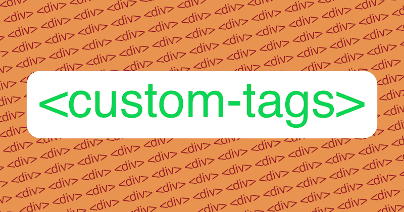
Responsive data attributes are also compatible with custom HTML elements.
<top-products data-sm="1column childpad" data-md="2column">
    <product-details>
        <!-- product 1 info -->
    </product-details>
    <product-details>
        <!-- product 2 info -->
    </product-details>
    <product-details>
        <!-- product 3 info -->
    </product-details>
    <product-details>
        <!-- product 4 info -->
    </product-details>
</top-products>
I love custom elements! They're powerful, plus they make your code easier to read and write. See my articles for more details:
Less than 1kb of CSS! (minified and gzipped) Free Download
The following layouts showcase the power and simplicity of the Responsive Attributes system:
The holy grail layout is considered one of the most difficult layouts to achieve so it's a perfect candidate to showcase how simple Responsive Attributes are to use.
<main data-sm="1column" data-md="2column" data-lg="4column">
    <header data-sm="pad" data-md="colspan2" data-lg="colspan4 order1">
        Header
    </header>
    <article data-sm="pad row" data-md="colspan2">
        Main content
    </article>
    <section data-sm="pad" data-lg="order2">
        Left sidebar
    </section>
    <aside data-sm="pad">
        Right sidebar
    </aside>
    <footer data-sm="pad" data-md="colspan2" data-lg="colspan4">
        Footer
    </footer>
</main>No extra CSS required, all the structural styles are handled by the Responsive Attributes system.
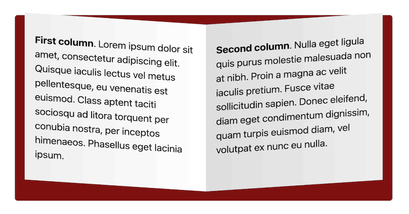
On mobile, the image sits above the text, on tablet and larger, the text is positioned to the right of the image.
<section
    data-sm="1column pad gap"
    data-md="3column middle pad2"
    >
    <figure>
        <img ... >
    </figure>
    <div data-md="colspan2">
        <h2>Image With Text On Right</h2>
        <!-- text here -->
    </div>
</section>On mobile, the image sits above the text, on tablet and larger, the text is positioned to the left of the image.
<section
    data-sm="1column pad gap"
    data-md="3column middle pad2"
    >
    <figure>
        <img ... >
    </figure>
    <div data-md="colspan2 order1">
        <h2>Image With Text On Left</h2>
        <!-- text here -->
    </div>
</section>"Responsive Attributes are so fun and easy to use - WIN!"
"I love how Responsive Attributes handles all of the responsive CSS for me."
"Once I added Responsive Attributes to my project laying out webpages was a breeze!"
"Such a simple system using only 3 data-attributes but oh so powerful."
<section
    data-sm="1column pad gap textc"
    data-md="2column"
    data-lg="4column"
    >
    <h2 data-md="colspan2" data-lg="colspan4 textc">Testimonials</h2>
    <figure data-sm="pad">
        <img ... class="round">
        <figcaption>
            <h3><!-- name here --></h3>
            <p><!-- testimonial here --></p>
        </figcaption>
    </figure>
    <figure data-sm="pad">
        <img ... class="round">
        <figcaption>
            <h3><!-- name here --></h3>
            <p><!-- testimonial here --></p>
        </figcaption>
    </figure>
    <figure data-sm="pad">
        <img ... class="round">
        <figcaption>
            <h3><!-- name here --></h3>
            <p><!-- testimonial here --></p>
        </figcaption>
    </figure>
    <figure data-sm="pad">
        <img ... class="round">
        <figcaption>
            <h3><!-- name here --></h3>
            <p><!-- testimonial here --></p>
        </figcaption>
    </figure>
</section>We only need a single line of CSS to make the images round:
.round {
    border-radius:50%;
}Responsive Attributes (which uses CSS grid under the hood) has over 96% browser support, so it's acceptable to use in most production environments (source).
A big thank you to Leb Cit who created the amazing Responsive Attributes Generator that allows you to easily incorporate this simple layout system into your favorite coding framework.
Read more of my web design articles:
ID vs Class: Which CSS Selector Should You Use?
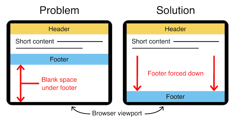
Holy Grail 3-Column Responsive Layout
Equal-Height Columns
Bottom Footer
How to add CSS to HTML
Responsive Columns:
 Web design
 Architecture
 Life drawing
 Art gallery
 Synesthesia
 Comics
© 1994 — 2026 Matthew James Taylor