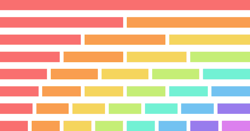
2 Column Layouts (Responsive, Flexbox & CSS Grid)
3 Nov 2025
Table of contents
- CSS Grid:
- Flexbox:
- Responsive Attributes:
- Responsive Columns:
In this article, we'll explore various types of two-column layouts plus I'll provide the HTML and CSS so you can use them for youself.
Let's get started.
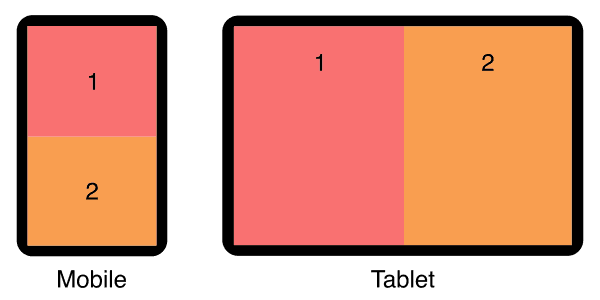
Static 2 Column Layout (CSS Grid)
This two-column layout uses CSS grid to make the columns stay side-by-side, equal-width, and equal-height even on small mobile screens.
Live demo
The HTML
<div class="two-columns-grid">
    <div>1</div>
    <div>2</div>
</div>
The CSS
/* container */
.two-columns-grid {
    display: grid;
    grid-template-columns: 1fr 1fr;
}

/* columns */
.two-columns-grid > * {
    padding:1rem;
}
Responsive 2 Column Layout (CSS Grid)
This two-column layout has stacked columns on mobile, and uses flexbox to align columns side-by-side on tablet and larger devices.
Live demo
The HTML
<div class="responsive-two-column-grid">
    <div>1</div>
    <div>2</div>
</div>
The CSS
/* container */
.responsive-two-column-grid {
    display:block;
}

/* columns */
.responsive-two-column-grid > * {
    padding:1rem;
}

/* tablet breakpoint */
@media (min-width:768px) {
    .responsive-two-column-grid {
        display: grid;
        grid-template-columns: 1fr 1fr;
    }
}
Static 2 Column Layout (Flexbox)
This two-column layout uses flexbox to make the columns stay side-by-side, equal-width, and equal-height even on small mobile screens.
Live demo
The HTML
<div class="two-columns">
    <div>1</div>
    <div>2</div>
</div>
The CSS
/* container */
.two-columns {
    display:flex;
}

/* columns */
.two-columns > * {
    width:50%;
    padding:1rem;
}
The element types used for the container and columns are not specifically referenced in the CSS so you don't have to use divs, you are free to use any kind of element, eg: <article>, <section>, <figure>, or whatever is best for your situation.
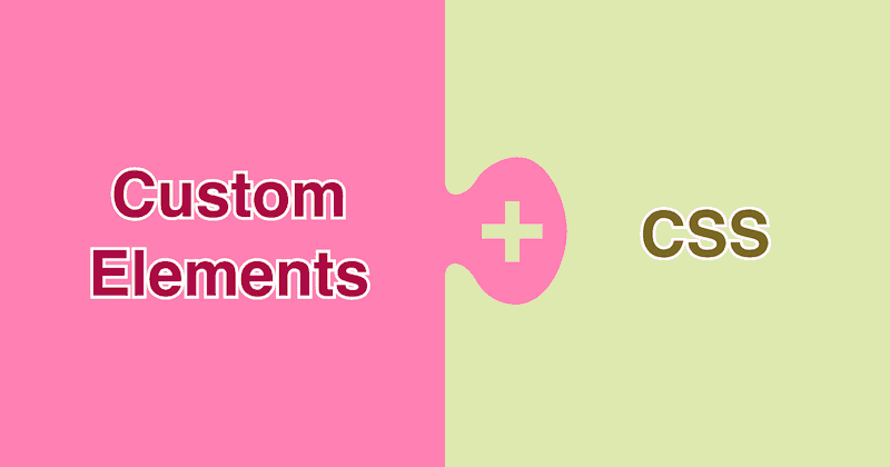
I recommend custom elements instead of divs. See why they're so much better in my article: Replace Divs With Custom Elements For Superior Markup.
How to add gutters (column-gap)
Flexbox is smart, you can add gutters between your columns and they will automatically reduce in size to compensate.
However...
If you add a flex-wrap:wrap; declaration on your container, the columns will trip over to multiple lines because they're too wide!
To fix this, we need to explicitly set the correct (narrower) width to each column to allow for the gutters.
Here's an example:
If you have gutters set to 2rem then each column width will be 50% minus 1rem.
/* container */
.two-columns {
    display:flex;
    column-gap:2rem;
}

/* columns */
.two-columns > * {
    width:calc(50% - 1rem);
}
Use the same units in your calc as you do in your column-gap declaration, they can be %, px, em, vw, vh, or whatever works best for your situation.
Responsive 2 Column Layout (Flexbox)
This two-column layout has stacked columns on mobile, and uses flexbox to align columns side-by-side on tablet and larger devices.
Live demo
The HTML
<div class="responsive-two-columns">
    <div>1</div>
    <div>2</div>
</div>
The CSS
/* container */
.responsive-two-columns {
    display:flex;
    flex-wrap:wrap;
}

/* columns */
.responsive-two-columns > * {
    width:100%;
    padding:1rem;
}

/* tablet breakpoint */
@media (min-width:768px) {
    .responsive-two-columns > * {
        width:50%;
    }
}
Add responsive padding
Use my special formula padding:calc(8px + 1.5625vw); to make your whitespace respond to screen size! See my article for details: Responsive Padding, Margin & Gutters With CSS Calc.
Left Sidebar 2 Column (flexbox)
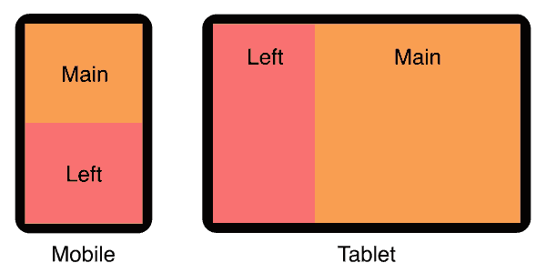
In this two-column layout, the main content is above the sidebar on mobile, and on tablet the sidebar is left of the main content.
For a full page version that includes a header and footer see my left sidebar responsive layout.
Live demo
The HTML
<div class="left-sidebar">
    <div>Main content</div>
    <div>Left sidebar</div>
</div>
The CSS
/* container */
.left-sidebar {
    display:flex;
    flex-wrap:wrap;
}

/* columns */
.left-sidebar > * {
    width:100%;
    padding:1rem;
}

/* tablet breakpoint */
@media (min-width:768px) {
    .left-sidebar > *:nth-child(1) {
        width:calc(100% / 3 * 2);
    }
    .left-sidebar > *:nth-child(2) {
        width:calc(100% / 3);
        order:-1;
    }
}
Right Sidebar 2 Column (flexbox)
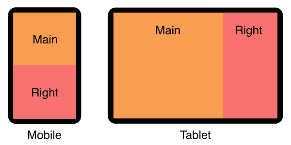
In this two-column layout, the main content is above the sidebar on mobile, and on tablet the sidebar is right of the main content.
For a full page version that includes a header and footer see my right sidebar responsive layout.
Live demo
The HTML
<div class="right-sidebar">
    <div>Main content</div>
    <div>Right sidebar</div>
</div>
The CSS
/* container */
.right-sidebar {
    display:flex;
    flex-wrap:wrap;
}

/* columns */
.right-sidebar > * {
    width:100%;
    padding:1rem;
}

/* tablet breakpoint */
@media (min-width:768px) {
    .right-sidebar > *:nth-child(1) {
        width:calc(100% / 3 * 2);
    }
    .right-sidebar > *:nth-child(2) {
        width:calc(100% / 3);
    }
}
Love Heart 2 Column Layout
Create a two-column photo love heart design with creative border radius settings.
This layout is designed to work with a square image background.
The HTML
<div class="heart">
    <div>
        <br>
    </div>
    <div>
        <br>
    </div>
</div>
The CSS
/* container */
.love-heart {
    display:flex;
    margin:0;
    padding:1rem;
    width:100%;
    aspect-ratio:1 / 1;
    /* min-height:100vh; */
    background:#f97171;
}

/* left column */
.love-heart > :first-child {
    width:50%;
    border-radius:50% 50% 0% 100% / 36% 26% 74% 64%;
    background-color:#fff;
    background-image:url(https://picsum.photos/640/640);
    background-size:cover;
    background-position:left 50%;
}

/* right column */
.love-heart > :last-child {
    width:50%;
    border-radius:50% 50% 100% 0% / 26% 36% 64% 74%;
    background-color:#fff;
    background-image:url(https://picsum.photos/640/640);
    background-size:cover;
    background-position:right 50%;
}
Note: I'm using Lorem Picsum for random photos as the column backgrounds. You can use whatever images you like.
Open Book 2 Column Layout
Create the illusion of an open book by skewing the left and right columns to make pages.
First column. Lorem ipsum dolor sit amet, consectetur adipiscing elit. Quisque iaculis lectus vel metus pellentesque, eu venenatis est euismod. Class aptent taciti sociosqu ad litora torquent per conubia nostra, per inceptos himenaeos. Phasellus eget lacinia ipsum.
Second column. Nulla eget ligula quis purus molestie malesuada non at nibh. Proin a magna ac velit iaculis pretium. Fusce vitae sollicitudin sapien. Donec eleifend, diam eget condimentum dignissim, quam turpis euismod diam, vel volutpat ex nunc eu nulla.
The HTML
<div class="open-book">
    <div>
        <!-- left page content -->
    </div>
    <div>
        <!-- right page content -->
    </div>
</div>
The CSS
/* book cover (container) */
.open-book {
    display:flex;
    margin:2rem 1rem 1rem;
    padding:1rem;
    background:#7e1010;
    border-radius:.3rem;
    gap:0;
}

/* left page */
.open-book > :first-child {
    transform-origin:100% 100%;
    transform:skew(0, 4deg);
    background:linear-gradient(90deg, #eee 0%, #fff 100%);
    padding:0 1em;
}

/* right page */
.open-book > :last-child {
    transform-origin:0 100%;
    transform:skew(0, -4deg);
    background:linear-gradient(90deg, #ddd 0%, #eee 100%);
    padding:0 1em;
}
Padded Boxes With Headings (flexbox)
In this two-column layout, each column has a colored heading and a padded grey box of content. each box is separated by a gutter. On mobile, the boxes are stacked vertically, on tablet and bigger, they sit side-by-side.
Live demo
Heading 1
Lorem ipsum dolor sit amet, consectetur adipiscing elit. Quisque iaculis lectus vel metus pellentesque.
Heading 2
Nulla eget ligula quis purus molestie malesuada non at nibh. Proin a magna ac velit iaculis pretium.
The HTML
<div class="padded-boxes">
    <section>
        <h3 class="heading">Heading 1</h3>
        <div class="padded">
            <!-- box 1 content -->
        </div>
    </section>
    <section>
        <h3 class="heading">Heading 2</h3>
        <div class="padded">
            <!-- box 2 content -->
        </div>
    </section>
</div>
You can add as many boxes as you like, they will simply wrap to multiple rows of two boxes wide.
The CSS
/* container */
.padded-boxes {
    display:flex;
    flex-wrap:wrap;
    gap:2rem;
}

/* boxes */
.padded-boxes > * {
    width:100%;
    background:#eee;
    border-radius:.4rem;
}

/* headings */
.padded-boxes .heading {
    background:#f97171;
    margin:0;
    padding:1rem;
    border-top-left-radius:.4rem;
    border-top-right-radius:.4rem;
}

/* padded content */
.padded-boxes .padded {
    padding:.1rem 1rem;
}

/* tablet breakpoint */
@media (min-width:768px) {
    .padded-boxes > * {
        width:calc(50% - 1rem);
    }
}
Static 2 Column Layout (Responsive Attributes)
In this two-column layout, I use my Responsive Attributes system to layout the columns side-by-side.
Live demo
The HTML
My Responsive Attributes system uses simple data-attributes to define the columns for each breakpoint:
<div data-sm="2column">
    <div>1</div>
    <div>2</div>
</div>
No CSS required
The Responsive Attributes system handles all the structural CSS for you. Learn how it works.
Responsive 2 Column (Responsive Attributes)
In this two-column layout, the columns are stacked on mobile then sit side-by-side on tablet. This is achieved with my Responsive Attributes system.
Live demo
The HTML
We simply specify 1 column for mobile breakpoints (sm), and 2 columns for tablet breakpoints (md) by adding two data-attributes:
<div data-sm="1column" data-md="2column">
    <div>1</div>
    <div>2</div>
</div>
No CSS required!
The Responsive Attributes system handles all the structural CSS for you. Learn how it works.
Static 2 Column Layout (Responsive Columns)
In this two-column layout, I use my Responsive Columns system to layout the columns side-by-side.
Live demo
The HTML
My Responsive Columns system uses tiny custom tags to define the layout:
<r-c join>
    <c1-2>
        1
    </c1-2>
    <c1-2>
        2
    </c1-2>
</r-c>
No CSS required
The Responsive Columns system handles all the structural CSS for you. Learn how it works.
Responsive 2 Column (Responsive Columns)
In this two-column layout, the columns are stacked on mobile then sit side-by-side on tablet. This is achieved with my Responsive Columns system.
Live demo
The HTML
<r-c join>
    <c1-1 sm1-2>
        1
    </c1-1>
    <c1-1 sm1-2>
        2
    </c1-1>
</r-c>
No CSS required!
The Responsive Columns system handles all the structural CSS for you. Learn how it works.
Full Browser Support
All layouts on this page are supported by over 96% of global browsers so they can be used in any production environment.
Flexbox and Responsive Columns browser support
- Google Chrome 29+
- Mozilla Firefox 28+
- Microsoft Edge 12+
- Apple Safari 9+
- Opera 17+
- Android Browser 4.4+
- Opera Mobile 12.1+
- Chrome for Android
- Firefox for Android
- Opera Mini
CSS grid browser support
- Google Chrome 57+
- Mozilla Firefox 52+
- Microsoft Edge 16+
- Apple Safari 10.1+
- Opera 44+
- Android Browser 109+
- Opera Mobile 73+
- Chrome for Android
- Firefox for Android
Need to support old browsers?
If you need to achieve 3 equal-height columns in old browsers (back to IE 5.5) that don't support CSS grid or flexbox, you can use my nested equal-height columns method, here is an example of a 2 column layout without flexbox.
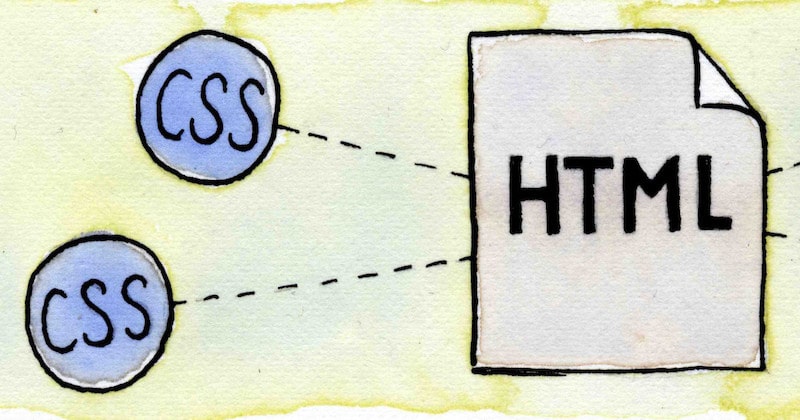
Do you know how HTML and CSS go together? See my beginners guide: How to add CSS to HTML (With Link, Embed, Import, and Inline styles).

Follow me on @mattjamestaylor


 Web design
 Architecture
 Life drawing
 Art gallery
 Synesthesia
 Comics