Column content
1 Column Layouts (Examples & Demo Files)
2 Feb 2022 — Updated 15 Jan 2023
Download
These layouts all use the Responsive Columns layout system.
Download All Demos
(responsive-columns.zip 155k)
One column layouts are pretty simple, but they come in many different forms.
In this article, we'll explore the various types of one-column layouts and show how to easily create them with the Responsive Columns layout system. You can download all of these demos with the handy link above.
Let's get started.
Basic 1 Column Layout
This one-column layout is about as simple as they come, it includes padding and a background color.
Column content
The HTML
<r-c join>
<c1-1>
Column content
</c1-1>
</r-c>
Fixed-Width 1 Column Layout
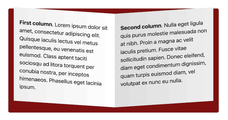
This one-column layout has a maximum width so lines of text don't get too long to read. The column is centered on the page when it's not 100% wide.
Lorem ipsum dolor sit amet, consectetur adipiscing elit. Quisque iaculis lectus vel metus pellentesque, eu venenatis est euismod. Class aptent taciti sociosqu ad litora torquent per conubia nostra, per inceptos himenaeos. Phasellus eget lacinia ipsum. Aenean gravida interdum enim, nec rhoncus orci mollis et. Maecenas posuere sed libero id porta. Aenean finibus nulla metus, vitae dictum odio pretium id.
The HTML
<r-c class="fixed-width">
<c1-1>
<!-- Content here -->
</c1-1>
</r-c>
The CSS
.fixed-width > * {
max-width:30em;
margin:0 auto;
}
Set your max-width in ems if you want the width to be relative to your text size. You can also use pixels or percentage widths if you prefer.
Full-Screen Centered 1 Column Layout
In this one-column layout, the column is forced to the full height of the screen and the content is centered horizontally and vertically.
Vertically and horizontally centered content
The HTML
<r-c join class="full-height-centered">
<c1-1 r-c middle>
<c1-1>
<!-- Content here -->
</c1-1>
</c1-1>
</r-c>
The CSS
.full-height-centered {
min-height:100vh;
text-align:center;
background:#f97171;
}
Full-Screen Photo, 1 Column Layout
This one-column layout is the height of your browser window and filled with a full screen photo for maximum effect.
The HTML
<r-c join class="full-height">
<c1-1 class="cover-photo">
<br>
</c1-1>
</r-c>
The CSS
.full-height {
min-height:100vh; /* vh = viewport height */
}
.cover-photo {
background-image:url(https://picsum.photos/640/480);
background-size:cover;
background-position:50% 50%;
}
Note: I'm using Lorem Picsum for a random photo as the column background. You can use whatever image you like.
1 Column Layout With Semantic HTML5 Tags
This one-column layout uses semantic HTML5 tags.
The HTML
<article data-r-c data-join>
<section data-c1-1 class="red">
<!-- column content -->
</section>
</article>
The Responsive Columns system is compatible with semantic tags. Full details here: How to use semantic HTML tags with responsive columns.
The CSS
.red {
background:#f97171;
}
Full Page Layouts With 1 Column
See my 1 column layout with responsive header and footer.
Full Browser Support
Responsive Columns works in all modern browsers, plus all old browsers that support Flexbox:
- Google Chrome 29+
- Mozilla Firefox 28+
- Microsoft Edge 12+
- Apple Safari 9+
- Opera 17+
- Android Browser 4.4+
- Opera Mobile 12.1+
- Chrome for Android
- Firefox for Android
- Opera Mini
The Responsive Columns Layout System Is Simple And Powerful
You can easily change the widths of your columns and change how they respond to different screen sizes.
Refer to the Responsive Columns Documentation to see how easy it is to create responsive layouts to your exact requirements.
Download
These layouts all use the Responsive Columns layout system.
Download All Demos
(responsive-columns.zip 155k)
In this article, we'll explore the various types of two-column layouts and show how easy they are to create with the Responsive Columns layout system. You can download all of these demos with the handy link above.
Let's get started.
2 Column Layout With Gutters
In this two-column layout, the columns stay side-by-side even on small mobile screens.
First column. Lorem ipsum dolor sit amet, consectetur adipiscing elit. Quisque iaculis lectus vel metus pellentesque, eu venenatis est euismod. Class aptent taciti sociosqu ad litora torquent per conubia nostra, per inceptos himenaeos. Phasellus eget lacinia ipsum.
Second column. Nulla eget ligula quis purus molestie malesuada non at nibh. Proin a magna ac velit iaculis pretium. Fusce vitae sollicitudin sapien. Donec eleifend, diam eget condimentum dignissim, quam turpis euismod diam, vel volutpat ex nunc eu nulla.
The HTML
<r-c>
<c1-2>
<!-- first column -->
</c1-2>
<c1-2>
<!-- second column -->
</c1-2>
</r-c>
The Responsive Columns layout system uses tiny custom HTML tags that make coding responsive layouts a breeze. You don't need to know any complicated CSS. See the documentation for more details on the custom HTML tags.
2 Fixed Columns With Equal-Width & Equal-Height
In this two-column layout, the columns stay side-by-side even on small mobile screens. It uses Flexbox CSS under the hood.
1
2
The HTML
<r-c join>
<c1-2 class="red">
1
</c1-2>
<c1-2 class="orange">
2
</c1-2>
</r-c>
We add the 'join' attribute to remove all gutters, join the columns together, and add padding. Learn more about gutter mode and join mode in the documentation.
The CSS
.red {
background:#f97171;
}
.orange {
background:#f99e50;
}
We only need CSS for the background colors, all the structural CSS is handled by the Responsive Columns system.
2 Responsive Columns, Equal-Width, Equal-Height
In this two-column layout, the columns stack vertically on mobile screens and move side-by-side on tablet and larger devices:
1
2
The HTML
<r-c join>
<c1-2 sm1-2 class="red">
1
</c1-2>
<c1-2 sm1-2 class="orange">
2
</c1-2>
</r-c>
We simply add width attributes to each column to specify sizes at different breakpoints. See more details on how to make columns responsive in the documentation.
The CSS
.red {
background:#f97171;
}
.orange {
background:#f99e50;
}
Full-Screen 2 Column Layout With Vertically Centered Content
In this two-column layout, the columns are forced to the height of your browser window but their content is vertically centered. This is great for titles or page sections that need to have a big impact as users scroll down.
Column 1 content
Column 2 content
The HTML
<r-c join class="full-height">
<c1-2 r-c middle class="red">
<c1-1>
<!-- column 1 content -->
</c1-1>
</c1-2>
<c1-2 r-c middle class="orange">
<c1-1>
<!-- column 2 content -->
</c1-1>
</c1-2>
</r-c>
The vertical centering is achieved by nesting columns and then adding a vertical alignment. See the powerful things you can achieve with nesting here: column nesting documentation.
The CSS
.full-height {
min-height:100vh; /* vh = viewport height */
}
.red {
background:#f97171;
}
.orange {
background:#f99e50;
}
Left Sidebar 2 Column Layout
In this two-column layout, the left column is a narrow sidebar. For a full page version that includes a header and footer see my left sidebar responsive layout.
Left sidebar
Main content
The HTML
<r-c join>
<c1-3 class="red">
Left sidebar
</c1-3>
<c2-3 class="orange">
Main content
</c2-3>
</r-c>
We change colum widths by using different custom HTML tags, see a complete list of column sizes and the associated tags in the documentation.
The CSS
.red {
background:#f97171;
}
.orange {
background:#f99e50;
}
Right Sidebar 2 Column Layout
In this two-column layout, the right column is a narrow sidebar. For a full-page version that includes a header and footer see my right sidebar responsive layout.
Main content
Right sidebar
The HTML
<r-c join>
<c2-3 class="red">
Main content
</c2-3>
<c1-3 class="orange">
Right sidebar
</c1-3>
</r-c>
The CSS
.red {
background:#f97171;
}
.orange {
background:#f99e50;
}
Love Heart 2 Column Layout
Create a two-column photo love heart design with creative border radius settings.
The HTML
<r-c join class="heart">
<c1-2>
<br>
</c1-2>
<c1-2>
<br>
</c1-2>
</r-c>
The CSS
.love-heart {
margin:0;
padding:1rem;
min-height:100vh;
background:#f97171;
}
.love-heart > :first-child {
border-radius:50% 50% 0% 100% / 36% 26% 74% 64%;
background-color:#fff;
background-image:url(https://picsum.photos/640/480);
background-size:cover;
background-position:50% 50%;
}
.love-heart > :last-child {
border-radius:50% 50% 100% 0% / 26% 36% 64% 74%;
background-color:#fff;
background-image:url(https://picsum.photos/640/480);
background-size:cover;
background-position:50% 50%;
}
Note: I'm using Lorem Picsum for random photos as the column backgrounds. You can use whatever images you like.
Open Book 2 Column Layout
Create the illusion of an open book by skewing the left and right columns.
First column. Lorem ipsum dolor sit amet, consectetur adipiscing elit. Quisque iaculis lectus vel metus pellentesque, eu venenatis est euismod. Class aptent taciti sociosqu ad litora torquent per conubia nostra, per inceptos himenaeos. Phasellus eget lacinia ipsum.
Second column. Nulla eget ligula quis purus molestie malesuada non at nibh. Proin a magna ac velit iaculis pretium. Fusce vitae sollicitudin sapien. Donec eleifend, diam eget condimentum dignissim, quam turpis euismod diam, vel volutpat ex nunc eu nulla.
The HTML
<r-c join class="open-book">
<c1-2>
<!-- left page content -->
</c1-2>
<c1-2>
<!-- right page content -->
</c1-2>
</r-c>
The CSS
.open-book {
margin:2rem 1rem 1rem;
padding:1rem;
background:#7e1010;
border-radius:.3rem;
gap:0;
}
.open-book > * {
background:#fff;
}
.open-book > :first-child {
transform-origin:100% 100%;
transform:skew(0, 4deg);
}
.open-book > :last-child {
transform-origin:0 100%;
transform:skew(0, -4deg);
background: linear-gradient(90deg, #eee 0%, #fff 100%);
}
2 Column Layout With Semantic HTML5 Tags
This two-column layout uses semantic HTML5 tags.
Column 1
Column 2
The HTML
<article data-r-c data-join>
<section data-c1-2 class="red">
<!-- column 1 -->
</section>
<section data-c1-2 class="orange">
<!-- column 2 -->
</section>
</article>
The Responsive Columns system is compatible with semantic tags. Full details here: How to use semantic HTML tags with responsive columns.
The CSS
.red {
background:#f97171;
}
.orange {
background:#f99e50;
}
Full Browser Support
Responsive Columns works in all modern browsers, plus all old browsers that support Flexbox:
- Google Chrome 29+
- Mozilla Firefox 28+
- Microsoft Edge 12+
- Apple Safari 9+
- Opera 17+
- Android Browser 4.4+
- Opera Mobile 12.1+
- Chrome for Android
- Firefox for Android
- Opera Mini
Need to support old browsers?
If you need to achieve 2 equal-height columns in old browsers (back to IE 5.5) that don't support flexbox CSS, you can use my nested equal-height columns method, here is an example of a 2 column layout without flexbox.
The Responsive Columns Layout System Is Simple And Powerful
You can easily change the widths of your columns and change how they respond to different screen sizes.
Refer to the Responsive Columns Documentation to see how easy it is to create responsive layouts to your exact requirements.