Download Full Layout Set
(perfect-liquid-layouts.zip 29kb).
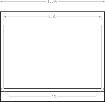
Percentage dimensions of the full page layout

All the dimensions are in percentage widths so the layout adjusts to any screen resolution. Vertical dimensions are not set so they stretch to the height of the content.
Maximum column content widths
To prevent wide content (like long URLs) from destroying the layout (long content can make the page scroll horizontally) the column content divs are set to overflow:hidden. This chops off any content that is wider than the div. Because of this, it's important to know the maximum widths allowable at common screen resolutions. For example, if you choose 800 x 600 pixels as your minimum compatible resolution what is the widest image that can be safely added before it gets chopped off? Here are the figures:
- 800 x 600
- Main page: 744 pixels
- 1024 x 768
- Main page: 960 pixels
The nested div structure
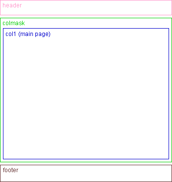
I've colour coded each div so it's easy to see:

The header, colmask and footer divs are 100% wide and stacked vertically one after the other. Col1 is inside colmask.
No CSS hacks
The CSS used for this layout is 100% valid and hack free. To overcome Internet Explorer's broken box model, no horizontal padding or margins are used. Instead, this design uses percentage widths and clever relative positioning.
No Images
This layout requires no images. Many CSS website designs need images to colour in the column backgrounds but that is not necessary with this design. Why waste bandwidth and precious HTTP requests when you can do everything in pure CSS and XHTML?
No JavaScript
JavaScript is not required. Some website layouts rely on JavaScript hacks to resize divs and force elements into place but you won't see any of that nonsense here.
Resizable text compatible
This layout is fully compatible with resizable text. Resizable text is important for web accessibility. People who are vision impaired can make the text larger so it's easier for them to read. It is becoming increasingly more important to make your website resizable text compatible because people are expecting higher levels of web accessibility. Apple have made resizing the text on a website simple with the pinch gesture on their multi-touch trackpad. So far this trackpad is only available on the MacBook Air but it will soon be rolled out to all of their systems. Is your website text-resizing compatible?
No Quirks Mode
This liquid layout does not require the XML declaration for it to display correctly in older versions of Internet Explorer. This version works without it and is thus never in quirks mode.
No IE Conditional Comments
Only one stylesheet is used with this layout This means that IE conditional comments are not needed to set extra CSS rules for older versions of Internet Explorer.
Browser Compatibility
This full page liquid Layout has been tested on the following browsers:
iPhone & iPod Touch
- Safari
Mac
- Safari
- Firefox
- Opera 9.25
- Netscape 9.0.0.5 & 7.1
Windows
- Firefox 1.5, 2 & 3
- Safari
- Opera 8.1 & 9
- Google Chrome
- Explorer 5.5, 6 & 7
- Netscape 8
Valid XHTML strict markup
The HTML in this layout validates as XHTML 1.0 strict.
This layout is FREE for anyone to use
That's right, you don't have to pay anything. Simply view the source of this page and save the HTML onto your computer. My only suggestion is to put the CSS into a separate file. If you are feeling generous however, link back to this page so other people can find and use this layout too.