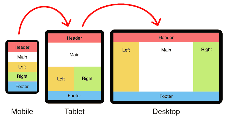
Holy Grail
Left Sidebar
Right Sidebar
1 Column
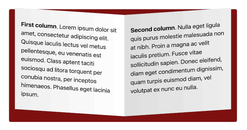
2 Columns
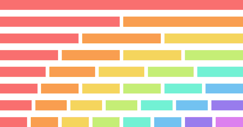
3 Columns
4 Columns
5 Columns
6 Columns
7 Columns
8 Columns
I've been working professionally as a web developer for over two decades and running this website since 1997. I am keenly interested in responsive layouts and their underlying HTML and CSS.
Responsive Padding, Margin & Gutters With CSS Calc
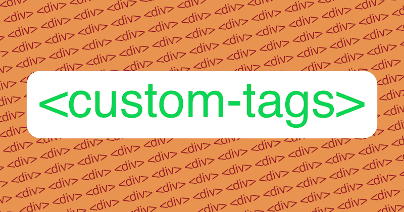
Custom HTML Tags (18 Things To Know Before Using Them)
Boggle Dice Shaker (Built With Javascript)
Style Blocker: How To Prevent CSS Cascade With Shadow DOM
Responsive Font Size (Optimal Text at Every Breakpoint)
Responsive Banner Ads with HTML5 and CSS3
ID vs Class: Which CSS Selector Should You Use? (6 Examples)
Holy Grail 3-Column Responsive Layout (CSS Grid & Flexbox Versions)
Equal-Height Columns (CSS Grid, Flexbox, Floated Containers, & Table Methods)
Empty HTML Tags (21 Weird Things You Need To Know!)
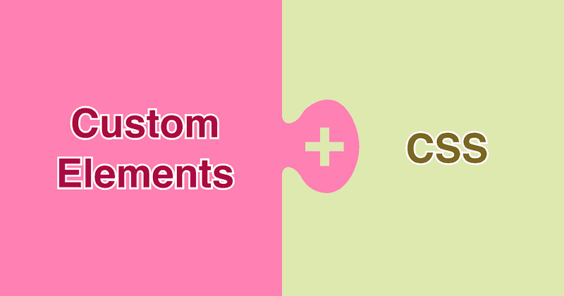
Replace Divs With Custom Elements For Superior Markup
Custom Element Examples (Without Javascript)
CSS: Margin Top vs Bottom (A Trick You Should Know)
CSS: Horizontally Centred Menus (With Optional Dropdowns)
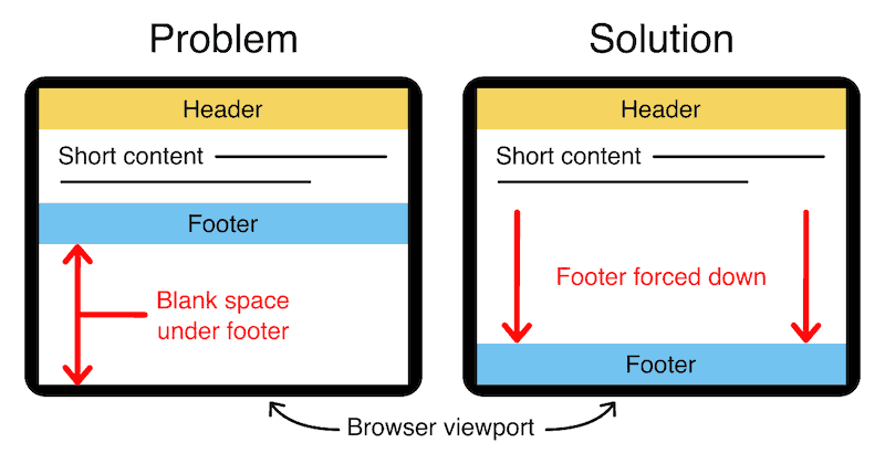
Bottom Footer (CSS Grid, Flexbox, & Absolute Position Methods)
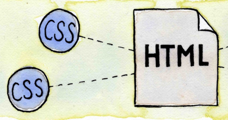
How to add CSS to HTML (With Link, Embed, Import, and Inline styles)
3 Column Layouts (Responsive, Flexbox & CSS Grid)
2 Column Layouts (Responsive, Flexbox & CSS Grid)
Responsive Columns: Build Amazing Layouts With Custom HTML Tags
Responsive Attributes: Generate CSS Grid Layouts With Simple HTML
Best Web Development Tools (Free & Paid)
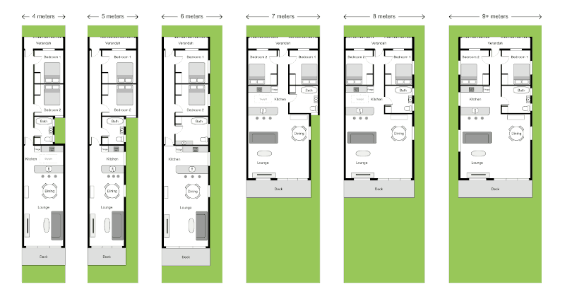
Responsive House Plan (Web Design Meets Architecture!)
Web design
Architecture
Life drawing
Art gallery
Synesthesia
Comics
About
Contact
Privacy
© 1994 — 2026 Matthew James Taylor


 Web design
 Architecture
 Life drawing
 Art gallery
 Synesthesia
 Comics