About this website
This website is my personal, online playground where I'm free to experiment with ideas and try new things. It also serves as a portfolio of my work, a gallery of my art, and an outlet to share my thoughts.
Read more about me or contact me.
Browse By Category
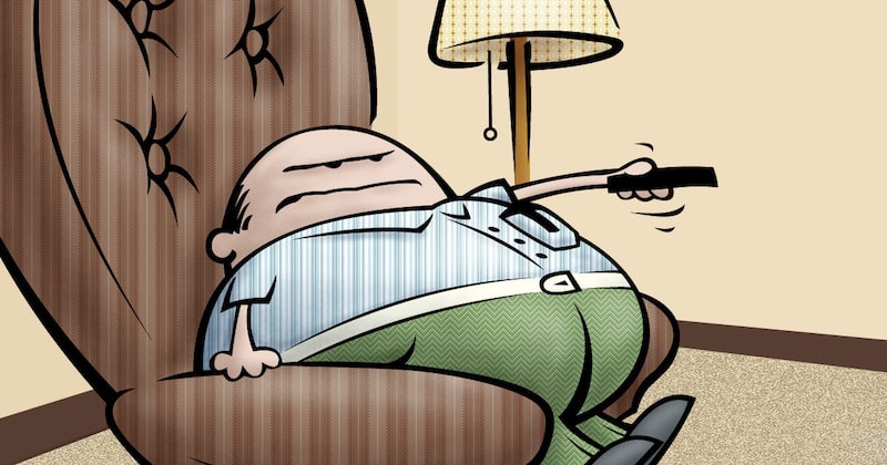
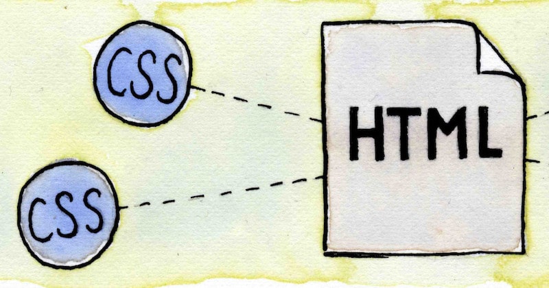
 Web design
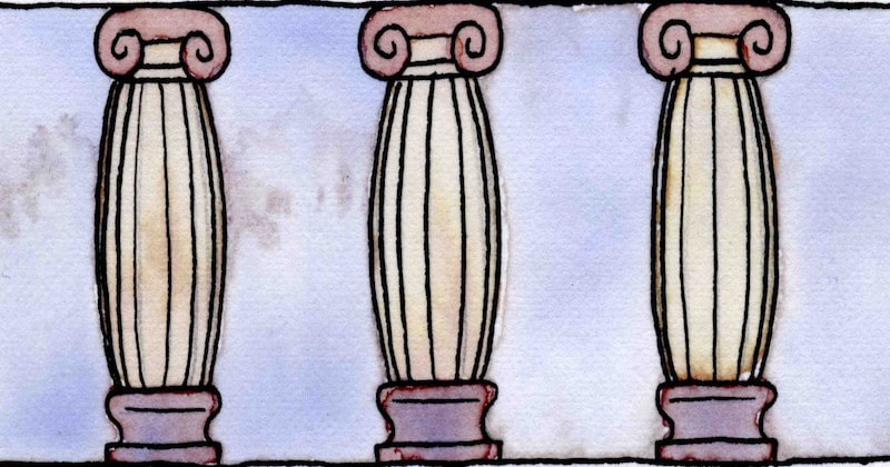
 Architecture
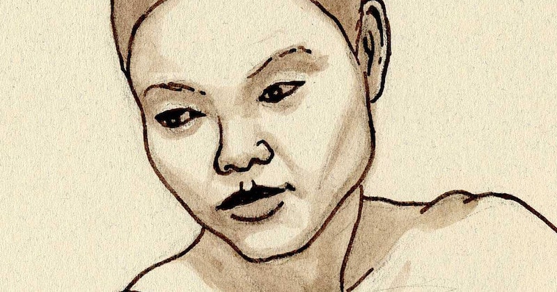
 Life drawing
 Art gallery
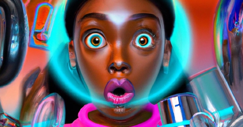
 Synesthesia
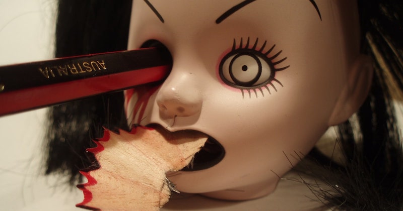
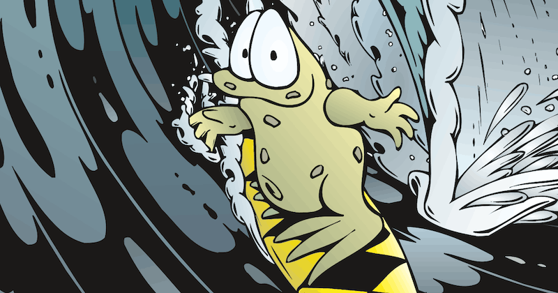
 Comics
Website History
I've been running this website since 1997!
Here's a brief timeline:

Version 1. "Music for your eyes"
(Late 1997 to January 1998)
My first website was called "Music for your eyes" and it was very basic indeed. It was set up on a shared, free host.
Unfortunately, I lost all traces of this version with a hard drive crash. At least it taught me to always back up my work, you can never be too careful!
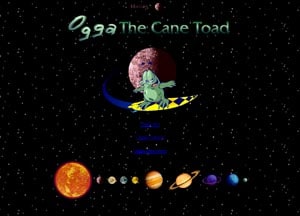
Version 2 "Space"
(January 1998 to October 1998)
This was a very simple design based around the solar system. Each section was on a different planet which was a nice idea but it didn't work out neatly. The number of planets did not match the sections I needed!
I was to learn a valuable lesson from this; never force something into a rigid structure, instead, it's best to let the content dictate the structure itself. A good website should be constantly changing and growing and that means the structure must change too.
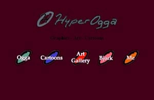
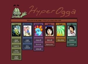
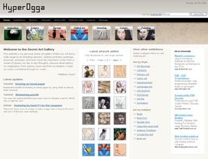
Version 3 "HyperOgga"
(October 1998 to December 1998)
This was my worst design ever, needless to say, it didn't last long before I changed it. Looking back at this now makes me realize just how far I've come over the years. I knew nothing about the web back then - well actually not many people did!
Version 4 "Panels"
(December 1998 to April 1999)
This was my first attempt at coding tables in HTML and it was such a mess. It looked OK in Internet Explorer but things were all over the place in Netscape. Still, I was proud of the result even though it was a headache to produce.
Tables were the 'in' thing back then - it's shameful to think of the mess we were creating but CSS was hardly known and certainly not supported in the common browsers of the day.
Version 5 "Ogga Vision"
(April 1999 to October 2001)
With this website, I finally started using my own domain, hyperogga.com.
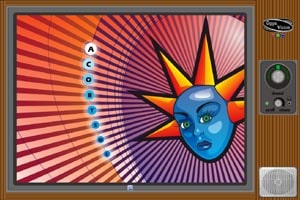
This site was a bit of a monster, as it grew it became a mish-mash of different styles and ideas making it difficult to navigate. There were also a lot of flash elements and frames making it a complete nightmare for accessibility.
But while there were a lot of problems with this old version I did like the design of many sections. The homepage was an old TV set and you navigated around by clicking the channels. It sure was the wild west of the internet back then.
Version 6 "Winged Skeleton"
(October 2001 to August 2002)
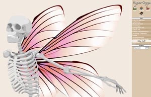
After coming from a complicated monster of a website I made this version basic with a flat HTML structure and a simple design. I wanted my front page to have a large image covering almost the entire screen and I did that with a scalable flash version of my winged skeleton drawing.
At this stage, I was starting to get serious about putting my art online.
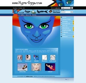
Version 7 "Blue"
(August 2002 to June 2004)
I loved this design, it was my first website written in ASP and it used a SQL 7 database as the backend.
I developed loads of new features like artwork searches and emailing art to friends etc.
The blue design took me weeks to work out because I wanted it to be just right. I was sad to see this version go but it was generating so much traffic that I had to close it down while I built another website that kept my hosting charges low.
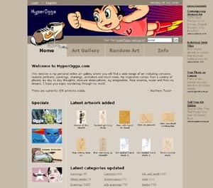
Version 8 "Simple Simple"
(June 2004 to May 2006)
Due to rising hosting costs, I made my large artwork 'members only' for this version. I didn't want to restrict access to the public but at the time I just couldn't afford to. However, while this change did stop a lot of my traffic in the short term, it eventually kept climbing anyway.
This was one of my most frequently updated website versions, I uploaded my latest art every week or two so there was always something new to see.
My main goal with this design was to keep things plain and simple in an attempt to make my art the focus, however, I think I may have gone a bit too far as it did look a little boring in parts.
Version 9 "Secret Art Gallery"
(May 2006 to September 2007)
With this version, I changed my domain to secretartgallery.com
This was my first website built to comply with the latest accessibility guidelines as suggested by the W3C. I used strict XHTML and CSS to code everything instead of tables, and it made for much faster browsing times.
The graphical buttons across the top of every page themed the site nicely and I improved the navigation to allow for thumbnails to be visible at the same time as a large artwork. As a bonus, visitors no longer needed to log in to view content.
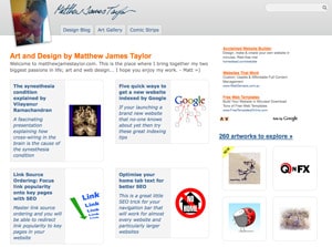
Version 10 "Matthew James Taylor"
(September 2007 to April 2010)
I finally settled on my name as my domain: matthewjamestaylor.com
This design was nice and clean and put a focus on my content.
It was my first website written in PHP and MySQL so it marked my move to open source technology. With this website version, I started building up a large library of articles in my blog to share all the lessons I'd learned along the way.
Version 11 "Watercolour Illustrations"
(April 2010 to August 2018)
In this version, I painted a little watercolor illustration for every blog post and tried to replicate the feel of a design magazine or an illustrated storybook.
I used bigger headlines and increased the whitespace throughout the design. Most of the pictures scaled along with the liquid layout so the design easily adjusted to any screen resolution. It definitely was my best version to date.
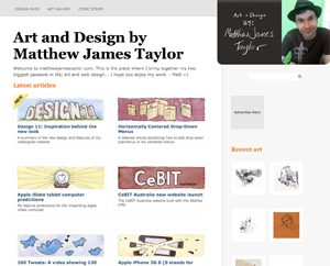
Version 12 "Brown and green"
(August 2018 to January 2022)
In this version, I combined about 400 pages of individual art pieces into a small set of art topic pages to keep similar work together.
I also finally implemented a responsive design so my website was compatible with small phone screens. I started using SSL to keep everything secure too.
Version 13 - "Combined"
(January 2022 to January 2023)
This version may have looked simple but it was getting a little too complicated in the back end.
The header structure for each post required all sorts of special positioning to make it work and this made it difficult to make variations for different articles.
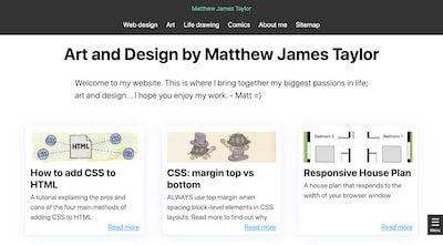
Version 14 - "Plain"
(January 2023 to now)
This is the current version that you're reading right now!
I ditched the top menu and removed all traces of layout background colors for the main interface. I also added a lot more white space to give the design a calmer feel.
My favorite change is bringing back a right side column of article thumbnails beside each article similar to version 11. I feel this encourages people to navigate to more pages during each visit.
It's been a long road. More than 24 years running this website and counting.
Who knows what will happen next?