Right Sidebar Responsive 2-Column Layout (CSS Grid & Flexbox)
3 Nov 2025
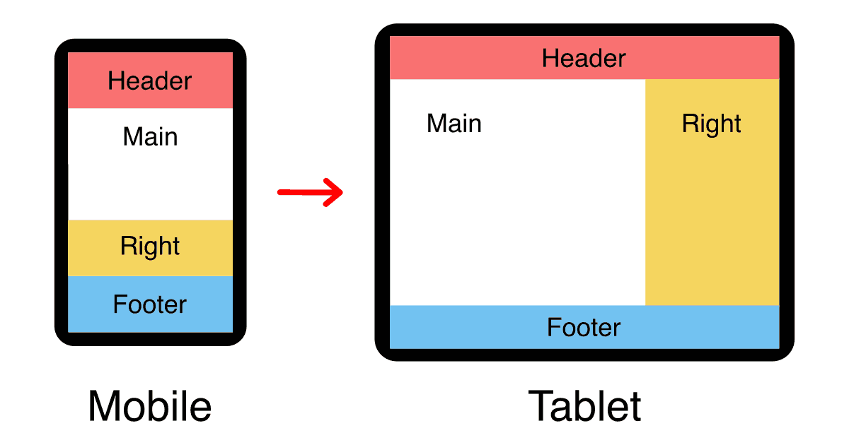
Table of contents
What Is The "Right Sidebar" Website Layout?
The right sidebar layout is a design with a vertical panel on the right side (called a sidebar) that typically contains a navigation menu, icons, buttons, or other content, and a large right column for the main content. A header and footer are often added to the two-column design.
In a responsive right sidebar layout on mobile devices, the header, main content, sidebar, and footer are stacked vertically in a single column.
In this article, I will show how to build the responsive right sidebar layout using six different methods; CSS grid, flexbox, Responsive Attributes, Responsive Columns, floated blocks, and tables. Which method you choose will depend on your browser compatibility requirements.
Right Sidebar Responsive 3-Column Layout (CSS Grid)
To create the right sidebar layout with CSS grid, we name our grid areas, assign each column to its correct area, then change the layout of grid areas at each breakpoint.
Live CSS grid demo
Semantic HTML5 markup
I'm using HTML tags that make the most sense for each part of the layout but you can use whatever elements make the most sense for your situation.
I recommend custom elements instead of divs. See why they're so much better in my article: Replace Divs With Custom Elements For Superior Markup.
<div class="right-sidebar-grid">
    <header class="header">Header</header>
    <main class="main-content">Main content</main>
    <section class="right-sidebar">right sidebar</section>
    <footer class="footer">Footer</footer>
</div>
I'm using classes above, but would ID's be better? See this article for the answer: ID vs Class: Which CSS Selector Should You Use?.
The CSS
/* grid container */
.right-sidebar-grid {
    display:grid;
    grid-template-areas:
        'header'
        'main-content'
        'right-sidebar'
        'footer';
}

/* general column padding */
.right-sidebar-grid > * {
    padding:1rem;
}

/* assign columns to grid areas */
.right-sidebar-grid > .header {
    grid-area:header;
    background:#f97171;
}
.right-sidebar-grid > .main-content {
    grid-area:main-content;
    background:#fff;
}
.right-sidebar-grid > .right-sidebar {
    grid-area:right-sidebar;
    background:#f5d55f;
}
.right-sidebar-grid > .footer {
    grid-area:footer;
    background:#72c2f1;
}

/* tablet breakpoint */
@media (min-width:768px) {
    .right-sidebar-grid {
        grid-template-columns:repeat(3, 1fr);
        grid-template-areas:
            'header header header'
            'main-content main-content right-sidebar'
            'footer footer footer';
    }
}
Layout features
- 2-step responsive design (mobile — tablet+)
- Equal-height columns
- 100% valid CSS with no hacks
- Main content comes before the sidebar in the HTML source (Good for accessibility and SEO)
- Compatible with Semantec HTML5 tags and custom elements
- No javascript required
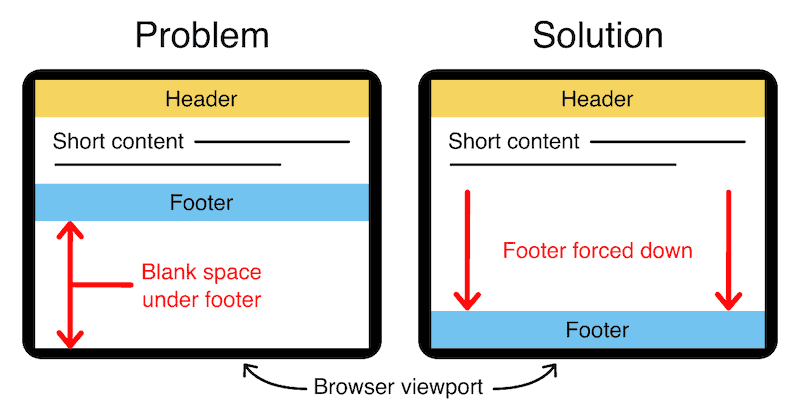
Want a bottom footer?
Push your footer to the bottom of the page when you have minimal content with this easy upgrade:
CSS grid browser support
CSS grid has over 96% browser support so it's acceptable to use in production environments (source).
- Google Chrome 57+
- Mozilla Firefox 52+
- Microsoft Edge 16+
- Apple Safari 10.1+
- Opera 44+
- Android Browser 109+
- Opera Mobile 73+
- Chrome for Android (all versions)
- Firefox for Android (all versions)
Internet Explorer(10+ year old browser)
Add responsive font size
Use my special formula to make your font size respond to screen size just like your layout:
html {
    font-size: calc(15px + 0.390625vw);
}
See my article for details: Responsive Font Size (Optimal Text at Every Breakpoint).
Right Sidebar Responsive 3-Column Layout (Flexbox)
To create the right sidebar layout with flexbox, we wrap our columns into three lines and adjust the width of each column at the different breakpoints.
Live flexbox demo
Semantic HTML5 markup
I'm using HTML tags that make the most sense for each part of the layout but you can use whatever elements make the most sense for your situation.
I recommend trying custom tags instead of divs. But before using them, read my article first: Custom HTML Tags (18 Things To Know Before Using Them).
<div class="right-sidebar-flexbox">
    <header class="header">Header</header>
    <main class="main-content">Main content</main>
    <section class="right-sidebar">Right sidebar</section>
    <footer class="footer">Footer</footer>
</div>
The CSS
/* flexbox container */
.right-sidebar-flexbox {
    display:flex;
    flex-wrap:wrap;
}

/* columns (mobile) */
.right-sidebar-flexbox > * {
    width:100%;
    padding:1rem;
}

/* background colors */
.right-sidebar-flexbox > .header {background:#f97171}
.right-sidebar-flexbox > .main-content {background:#fff}
.right-sidebar-flexbox > .right-sidebar {background:#f5d55f}
.right-sidebar-flexbox > .footer {background:#72c2f1}

/* tablet breakpoint */
@media (min-width:768px) {
    .right-sidebar-flexbox > .right-sidebar {
        width:calc(100% / 3);
    }
    .right-sidebar-flexbox > .main-content {
        width:calc(100% / 3 * 2);
    }
}
Layout features
- 2-step responsive design (mobile — tablet+)
- Equal-height columns
- 100% valid CSS with no hacks
- Main content comes before the sidebar in the HTML source (Good for accessibility and SEO)
- Compatible with Semantec HTML5 tags and custom elements
- No javascript required
Add responsive padding
Use my special formula padding:calc(8px + 1.5625vw); to make your whitespace respond to screen size! See my article for details: Responsive Padding, Margin & Gutters With CSS Calc.
Flexbox browser support
Flexbox has over 98% browser support so it's more than acceptable to use in production environments (source).
- Google Chrome 29+
- Mozilla Firefox 28+
- Microsoft Edge (all versions)
- Apple Safari 9+
- Opera 17+
- Android Browser 4.4+
- Opera Mobile 12.1+
- Chrome for Android (all versions)
- Firefox for Android (all versions)
- Opera Mini (all versions)
Internet Explorer(10+ year old browser)
Right Sidebar 3-Column Layout (Responsive Attributes)
Responsive Attributes is a CSS Grid-based layout system that I developed, it allows anyone to build advanced responsive layouts with just simple HTML.
See my Responsive Attributes documentation to see how easy and powerful it is to use.
Live Responsive Attributes demo
HTML markup with data-attribute breakpoints
Responsive Attributes works by adding simple data-attributes to any HTML element to define grid-based columns for each breakpoint.
Here's how easy it is to create the right sidebar layout:
<main data-sm="1column" data-md="3column">
    <header data-sm="pad" data-md="colspan3">
        Header
    </header>
    <article data-sm="pad row" data-md="colspan2">
        Main content
    </article>
    <section data-sm="pad">
        Right sidebar
    </section>
    <footer data-sm="pad" data-md="colspan3">
        Footer
    </footer>
</main>
No CSS required!
All the structure and responsive styles of Responsive Attributes are handled by a single tiny CSS file that's less than 1kb! It's so easy to include it in any project.
Download Responsive Attributes and start experimenting.
Layout features
- 2-step responsive design (mobile — tablet+)
- Equal-height columns
- 100% valid CSS with no hacks
- Main content comes before the sidebar in the HTML source (Good for accessibility and SEO)
- Compatible with Semantec HTML5 tags and custom elements
- No javascript required
Responsive Attributes browser support
Responsive Attributes uses CSS grid under the hood. Grid has over 96% browser support so it's acceptable for use in production environments (source).
- Google Chrome 57+
- Mozilla Firefox 52+
- Microsoft Edge 16+
- Apple Safari 10.1+
- Opera 44+
- Android Browser 109+
- Opera Mobile 73+
- Chrome for Android (all versions)
- Firefox for Android (all versions)
Internet Explorer(10+ year old browser)
Right Sidebar 3-Column Layout (Responsive Columns)
Responsive Columns is a layout system that I developed where advanced responsive layouts can be coded with custom HTML tags and no extra CSS is required.
See my Responsive Columns documentation to see how quick and powerful it is to use.
Live Responsive Columns demo
HTML markup with custom elements
By default, Responsive Columns works with tiny custom elements and attributes to define any responsive layout.
<r-c join>
    <c1-1>Header</c1-1>
    <c1-1 sm2-3>Main content</c1-1>
    <c1-1 sm1-3>Right sidebar</c1-1>
    <c1-1>Footer</c1-1>
</r-c>
Optional semantic HTML5 markup
You can also use Responsive Columns with semantic HTML elements by adding data-attributes to specify your layout.
<main data-r-c data-join>
    <header>Header</header>
    <article data-sm2-3>Main content</article>
    <section data-sm1-3>Right sidebar</section>
    <footer>Footer</footer>
</main>
No CSS required!
All the structure and responsive styles of Responsive Columns are handled by a single tiny CSS file that is easy to include in any project.
Download Responsive Columns and start experimenting.
Layout features
- 2-step responsive design (mobile — tablet+)
- Equal-height columns
- 100% valid CSS with no hacks
- Main content comes before the sidebar in the HTML source (Good for accessibility and SEO)
- Compatible with Semantec HTML5 tags and custom elements
- No javascript required
Responsive Columns browser support
Responsive Columns uses flexbox under the hood. Flexbox has over 98% browser support so it's more than acceptable to use in production environments (source).
- Google Chrome 29+
- Mozilla Firefox 28+
- Microsoft Edge (all versions)
- Apple Safari 9+
- Opera 17+
- Android Browser 4.4+
- Opera Mobile 12.1+
- Chrome for Android (all versions)
- Firefox for Android (all versions)
- Opera Mini (all versions)
Internet Explorer(10+ year old browser)
Right Sidebar Responsive 3-Column Layout (Floated Blocks)
We can create the right sidebar layout with only floated blocks by nesting a set of offset containers to create the columns.
Live floated blocks demo
Semantic HTML5 markup
I'm using HTML tags that make the most sense for each part of the layout but you can use whatever elements make the most sense for your situation.
<div class="right-sidebar-floated-blocks">
    <div class="header">Header</div>
    <div class="main-wrap">
        <div class="right-wrap">
            <div class="main-content">Main content</div>
            <div class="right-sidebar">Right sidebar</div>
        </div>
    </div>
    <div class="footer">Footer</div>
</div>
The CSS
/* set correct box model */
.right-sidebar-floated-blocks * {
    box-sizing:border-box;
}

/* floated container */
.right-sidebar-floated-blocks {
    overflow:hidden;
}
/* stacked columns on mobile */
.right-sidebar-floated-blocks .header {
    padding:1rem;
    background:#f97171;
}
.right-sidebar-floated-blocks .main-content {
    padding:1rem;
    background:#fff;
}
.right-sidebar-floated-blocks .right-sidebar {
    padding:1rem;
    background:#f5d55f;
}
.right-sidebar-floated-blocks .footer {
    padding:1rem;
    background:#72c2f1;
}

/* tablet breakpoint */
@media (min-width:768px) {
    .right-sidebar-floated-blocks .main-wrap {
        background:#f5d55f;
        float:left;
        width:100%;
    }
    .right-sidebar-floated-blocks .right-wrap {
        position:relative;
        right:calc(100%/3);
        background:#fff;
        float:left;
        width:100%;
    }
    .right-sidebar-floated-blocks .main-content {
        width:calc(100%/3*2);
        position:relative;
        left:calc(100%/3);
        background:none;
        float:left;
    }
    .right-sidebar-floated-blocks .right-sidebar {
        width:calc(100%/3);
        position:relative;
        left:calc(100%/3);
        float:right;
    }
    .right-sidebar-floated-blocks .footer {
        clear:both;
    }
}
Do you know how HTML and CSS go together? See my beginner guide: How to add CSS to HTML (With Link, Embed, Import, and Inline styles).
Layout features
- No CSS grid or flexbox
- Internet Explorer compatible
- 2-step responsive design (mobile — tablet+)
- Equal-height columns
- 100% valid CSS with no hacks
- Main content comes before the sidebar in the HTML source (Good for accessibility and SEO)
- Compatible with Semantec HTML5 tags and custom elements
- No javascript required
Browser support
The floated boxes' right sidebar layout requires the box-sizing:border-box CSS property, this has over 99% browser support! (source)
- Google Chrome 10+
- Mozilla Firefox 29+
- Microsoft Edge (all versions)
- Apple Safari 5.1+
- Opera (all versions)
- Android Browser 4+
- Opera Mobile 12+
- Chrome for Android (all versions)
- Firefox for Android (all versions)
- Opera Mini (all versions)
- Internet Explorer 8+
Need to support even older browsers? 🧐
If you need to achieve 3 equal-height columns in old browsers (back to IE 5.5) that don't support box-sizing:border-box, you can use my nested equal-height columns method, here is an example of a 3 column layout with offsets instead of padding.
Right Sidebar Static 2-Column Layout (Tables)
To create the right sidebar layout with tables we lose the responsive functionality but we gain browser support.
Sometimes tables are still necessary, for example, in HTML emails.
Live table layout demo
| Header | |
| Main content | Right sidebar | Footer |
Table markup
When using tables for layout you don't require <thead> or <tbody> containers.
<table class="right-sidebar-tables">
    <tr>
        <td colspan="2" class="header">Header</td>
    </tr>
    <tr>
        <td class="main-content">Main content</td>
        <td class="right-sidebar">Right sidebar</td>
    </tr>
        <td colspan="2" class="footer">Footer</td>
    </tr>
</table>
The CSS
If you're using this table-based layout for an HTML email you may need to inline your styles to make them work in all email clients, see how to inline CSS.
/* table container */
.right-sidebar-tables {
    width:100%;
    border:0;
    border-collapse:collapse;
}

/* table cells */
.right-sidebar-tables .header {
    padding:16px;
    background:#f97171;
}
.right-sidebar-tables .right-sidebar {
    padding:16px;
    width:33.33333%;
    background:#f5d55f;
}
.right-sidebar-tables .main-content {
    padding:16px;
    width:66.66666%;
    background:#fff;
}
.right-sidebar-tables .footer {
    padding:16px;
    background:#72c2f1;
}
Layout features
- Amazing browser support
Responsive- Equal-height columns
- 100% valid CSS with no hacks
- Main content comes before the sidebar in the HTML source (Good for accessibility and SEO)
Compatible with Semantec HTML5 tags and custom elements- No javascript required
Browser support for table layouts
Table layouts have over 99% browser support plus it's the only option for HTML emails.
- Google Chrome (all versions)
- Mozilla Firefox (all versions)
- Microsoft Edge (all versions)
- Apple Safari (all versions)
- Opera (all versions)
- Android Browser 4.4+
- Opera Mobile (all versions)
- Chrome for Android (all versions)
- Firefox for Android (all versions)
- Internet Explorer (all versions)
Compatible addons
The responsive layouts in this article are fully compatible with the following:

Follow me on @mattjamestaylor


 Web design
 Architecture
 Life drawing
 Art gallery
 Synesthesia
 Comics