Bottom Footer (CSS Grid, Flexbox, & Absolute Position Methods)
3 Nov 2025
Table of contents
In this article, I will show how to keep footers at the bottom of the page with CSS grid, Flexbox, and absolute positioning methods.
But first, why would we want to do this?
The Problem With Website Footers
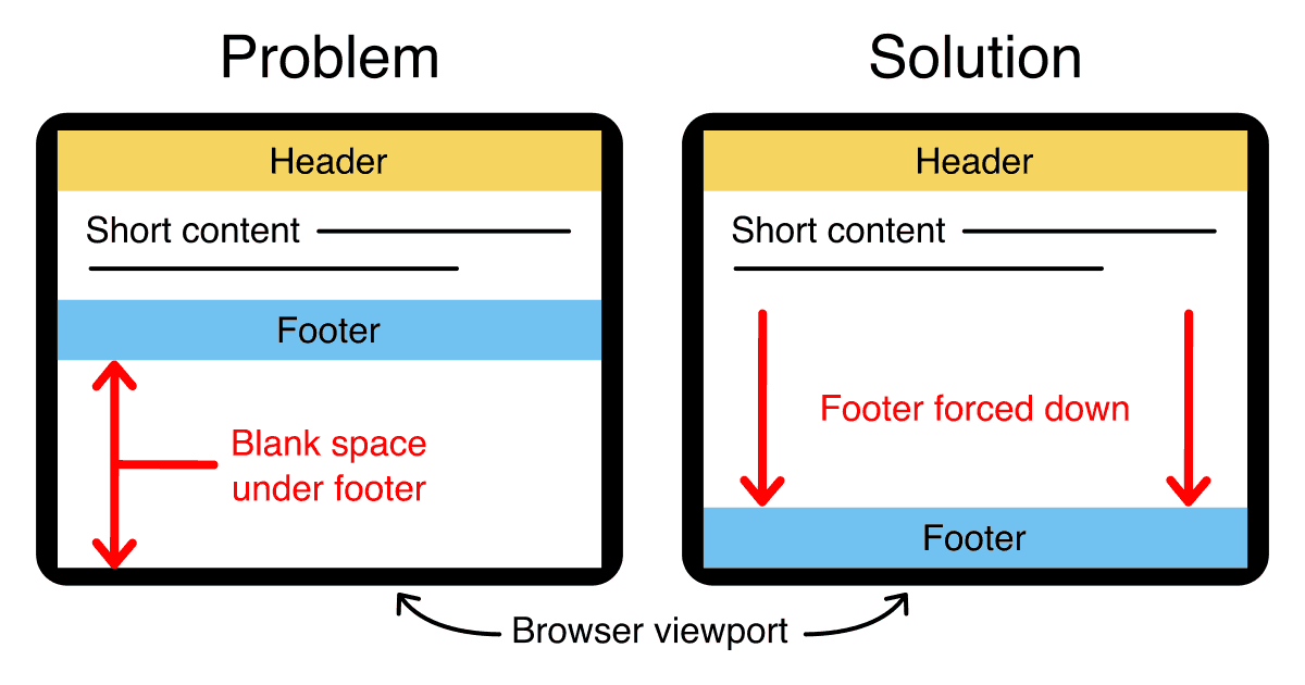
When an HTML page contains a small amount of content, the footer can sometimes sit halfway up the page leaving a blank space underneath.
This can look bad, particularly on a large screen.
Web designers are often asked to push footers down to the bottom of the viewport, but it's not immediately obvious how this can be done.
How to Push Footers to the Bottom of a Webpage
The ideal solution must satisfy the following 3 criteria:
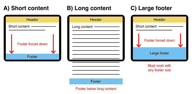
- A) Short content: Footer gets pushed down to the bottom of the viewport.
- B) Long content: Footer comes after long content (pushed below the viewport).
- C) Large footer: The solution must work with footers of variable height.
Now, let's look at the three methods...
CSS Grid — Bottom Footer
To make a bottom footer with CSS grid we give our grid container a min-height equal to the viewport height then instruct our main content column to take up any leftover space.
Demo
The HTML
<div id="grid-container">
   <header>
         Header
   </header>
   <article>
         Main content
   </article>
   <footer>
         Footer
   </footer>
</div>
The CSS
We set the height of the grid container to 100vh (100% viewport height) or 100svh (100% small viewport height) for modern browsers. Then, the auto declarations cause the header and footer to stay at their natural height while the 1fr (one fraction) declaration causes the main content area to grow in height to fill the remaining vertical space.
#container {
   display:grid;
   grid-template-rows:auto 1fr auto;
   grid-template-columns:100%;

   /* fallback height */
   min-height:100vh;

   /* new small viewport height for modern browsers */
   min-height:100svh;
}
You can read more information about the new viewport units on web.dev (source).
CSS grid browser support
CSS grid has over 96% browser support so it's acceptable to use in production environments (source).
- Google Chrome 57+
- Mozilla Firefox 52+
- Microsoft Edge 16+
- Apple Safari 10.1+
- Opera 44+
- Android Browser 109+
- Opera Mobile 73+
- Chrome for Android (all versions)
- Firefox for Android (all versions)
Internet Explorer(10+ year old browser)
Download the demo files
Everything you need for all three methods is in one handy download:
Free Download
(bottom-footer.zip 8kb)
Popular layouts with bottom footers
Want a bottom footer on a popular layout? I've done it for you!
Holy grail layout
Bottom footer demo
Holy grail layout details
Left sidebar layout
Bottom footer demo
Left sidebar layout details
Right sidebar layout
Bottom footer demo
Right sidebar layout details
Flexbox — Bottom Footer
To make a bottom footer with flexbox we give our flex container a min-height equal to the viewport height then force our footer down to the bottom of the flex container.
Demo
The HTML
<div id="flex-container">
   <header>
         Header
   </header>
   <article>
         Main content
   </article>
   <footer>
         Footer
   </footer>
</div>
The CSS
We set the height of the flex container to 100vh (100% viewport height) or 100svh (100% small viewport height) for modern browsers. Then, we add a margin-top of auto to the footer to force it down to the bottom of the flex container.
#flex-container {
   display:flex;
   flex-direction:column;

   /* fallback height */
   min-height:100vh;

   /* new small viewport height for modern browsers */
   min-height:100svh;
}
#flex-container > footer {
   margin-top:auto;
}
You can read more information about the new viewport units on web.dev (source).
Flexbox browser support
Flexbox has over 98% browser support so it's more than acceptable to use in production environments (source).
- Google Chrome 29+
- Mozilla Firefox 28+
- Microsoft Edge (all versions)
- Apple Safari 9+
- Opera 17+
- Android Browser 4.4+
- Opera Mobile 12.1+
- Chrome for Android (all versions)
- Firefox for Android (all versions)
- Opera Mini (all versions)
Internet Explorer(10+ year old browser)
Download the demo files
Everything you need for all three methods is in one handy download:
Free Download
(bottom-footer.zip 8kb)
Absolute Positioning — Bottom Footer
If you need to support old browsers that don't understand CSS grid and flexbox then you need to use the absolute positioning method.
One compromise with this method is we must set a static height for our footer but we gain excellent browser support.
Demo
Bottom footer absolute position demo →
The HTML div structure required
<div id="position-container">
   <div id="header"></div>
   <div id="body"></div>
   <div id="footer"></div>
</div>
There are only four divs required for this to work. The first is a container div that surrounds everything. Inside that are three more divs; a header, a body, and a footer. That's it, all the magic happens in the CSS.
The CSS rules
html,
body {
   margin:0;
   padding:0;
   height:100%;
}
#position-container {
   min-height:100%;
   position:relative;
}
#header {
   background:#f5d55f;
   padding:10px;
}
#body {
   padding:10px;
   padding-bottom:60px;	/* Height of the footer */
}
#footer {
   position:absolute;
   bottom:0;
   width:100%;
   height:60px; /* Height of the footer */
   background:#72c2f1;
}
And one simple CSS rule for IE 6 and IE 5.5 if you need to support old browsers. We expose this with IE conditional comments.
#position-container {
   height:100%;
}
Let's look at the CSS rules for each element:
The HTML and Body Tags
The HTML and body tags must be set to height:100%; this allows us to set a percentage height on our container div later.
I have also removed the margins and padding on the body tag so there are no spaces around the parameter of the page.
The Container Div
The container div has a min-height:100%; this will ensure it stays the full height of the screen even if there is hardly any content. It is also set to position:relative; this allows us to absolutely position elements inside it later.
The Header Div
There is nothing unusual with the header. Make it whatever color and size you like.
The Body Div
The body is quite normal too. The only important thing is it must have a bottom padding that is equal to (or slightly larger than) the height of the footer. You can also use a bottom border if you prefer but a margin won't work.
The Footer Div
The footer has a set height in pixels (or ems). The div is absolutely positioned bottom:0; this moves it to the bottom of the container div.
When there is little content on the page the container div is exactly the height of the browser viewport (because of the min-height:100%;) and the footer sits neatly at the bottom of the screen.
When there is more than a page of content the container div becomes larger and extends down below the bottom of the viewport - the footer is still positioned at the bottom of the container div but this time you need to scroll down to the end of the page to see it. The footer is also set to width:100%; so it stretches across the whole page.
The IE 6 & IE 5.5 CSS
Older versions of Internet Explorer don't understand the min-height property but lucky for us the normal height property behaves the same way in these old Microsoft browsers, that is, it will stretch to 100% height of the viewport but if the content is longer it will stretch even further.
We simply expose this 100% height rule to Internet Explorer only by using IE conditional comments. View the source on the demo to see how this is done.
Download the demo files
Everything you need for all three methods is in one handy download:
Free Download
(bottom-footer.zip 8kb)
Main Features of the absolute positioning method
This method uses 100% valid CSS and it works in all standards-compliant browsers. It also fails gracefully with older browsers so it's safe to use on any website.
Works in All Modern, Standards-Compliant Browsers
Compatible browsers: Firefox (Mac & PC), Safari (Mac & PC), Internet Explorer 7, 6 & 5.5, Opera and Netscape 8
Fails Gracefully on Older Browsers
Older non-standards compliant browsers position the footer under the content as normal.
We can't help it if people are using an out-of-date browser, all we can do is reward people who have upgraded by giving them a better browsing experience through progressive enhancement.
Longer Content Pushes the Footer Off the Page
On long pages with lots of content, the footer is pushed off the visible page to the very bottom. Just like a normal website, it will come into view when you scroll down. This means that the footer isn't always taking up precious reading space.
100% Valid CSS With No Hacks
The CSS used in this demo is 100% valid and contains no hacks.
No JavaScript Required
JavaScript is not necessary because it works with pure CSS.
iPhone Compatible
This method also works on the iPhone and iPod Touch in the mobile Safari browser.
Limitations With This Method
There is only one limitation.
You must set the height of the footer div to something other than auto. Choose any height you like, but make sure the value is specified in pixels or ems within your CSS. This is not a big limitation, but it is essential for this method to work correctly.
If you have a lot of text in your footer then it's also a good idea to give the text a bit more room at the bottom by making your footer a bit deeper. This is to cater to people who have their browser set to a larger text size by default.
Another way to solve the same problem is to set the height of the footer in em units; this will ensure that the footer grows in size along with the text. If you only have images in your footer then there's nothing to worry about — just set your footer height to a pixel value and away you go.

Follow me on @mattjamestaylor


 Web design
 Architecture
 Life drawing
 Art gallery
 Synesthesia
 Comics