3 Column Layouts (Responsive, Flexbox & CSS Grid)
3 Nov 2025
Table of contents
- CSS Grid:
- Flexbox:
- Responsive Attributes:
- Responsive Columns:
In this article, we'll explore various types of three-column layouts plus I'll provide the HTML and CSS so you can use them for youself.
Let's get started.
Static 3 Column Layout (CSS Grid)
This three-column layout uses CSS grid to make the columns stay side-by-side, equal-width, and equal-height even on small mobile screens.
Live demo
The HTML
<div class="three-columns-grid">
    <div>1</div>
    <div>2</div>
    <div>3</div>
</div>
The CSS
/* container */
.three-columns-grid {
    display: grid;
    grid-auto-rows: 1fr;
    grid-template-columns: 1fr 1fr 1fr;
}

/* columns */
.three-columns-grid > * {
    padding:1rem;
}
Responsive 3 Column Layout (CSS Grid)
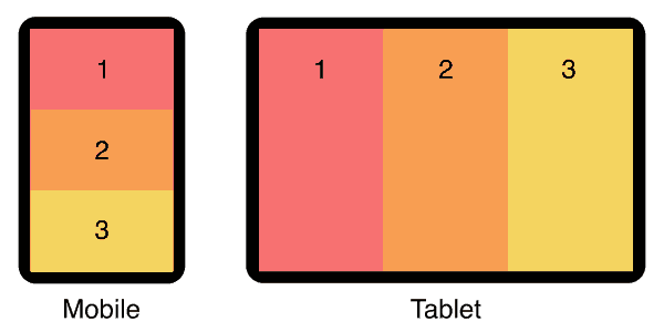
This three-column layout has stacked columns on mobile, and uses flexbox to align columns side-by-side on tablet and larger devices.
Live demo
The HTML
<div class="responsive-three-column-grid">
    <div>1</div>
    <div>2</div>
    <div>3</div>
</div>
The CSS
/* container */
.responsive-three-column-grid {
    display:block;
}

/* columns */
.responsive-three-column-grid > * {
    padding:1rem;
}

/* tablet breakpoint */
@media (min-width:768px) {
    .responsive-three-column-grid {
        display: grid;
        grid-auto-rows: 1fr;
        grid-template-columns: 1fr 1fr 1fr;
    }
}
Static 3 Column Layout (Flexbox)
This three-column layout uses flexbox to make the columns stay side-by-side, equal-width, and equal-height even on small mobile screens.
Live demo
The HTML
<div class="three-columns">
    <div>1</div>
    <div>2</div>
    <div>3</div>
</div>
The CSS
/* container */
.three-columns {
    display:flex;
}

/* columns */
.three-columns > * {
    width:calc(100% / 3);
    padding:1rem;
}
The element types used for the container and columns are not specifically referenced in the CSS so you don't have to use divs, you are free to use any kind of element, eg: <article>, <section>, <figure>, or whatever is best for your situation.
I recommend custom elements instead of divs. See why they're so much better in my article: Replace Divs With Custom Elements For Superior Markup.
How to add gutters (column-gap)
Flexbox is smart, you can add gutters between your columns and they will automatically reduce in size to compensate.
However...
If you add a flex-wrap:wrap; declaration on your container, the columns will trip over to multiple lines because they're too wide!
To fix this, we need to explicitly set the correct (narrower) width to each column to allow for the gutters.
Here's an example:
If you have gutters set to 2rem, then that's a total of 4rem of gutter-width between your three columns. So each column width will be 100% minus 4rem then divided by 3.
/* container */
.three-columns {
    display:flex;
    column-gap:2rem;
}

/* columns */
.three-columns > * {
    width:calc((100% - 4rem) / 3);
}
Use the same units in your calc as you do in your column-gap declaration, they can be %, px, em, vw, vh, or whatever works best for your situation.
Responsive 3 Column Layout (Flexbox)
This three-column layout has stacked columns on mobile, and uses flexbox to align columns side-by-side on tablet and larger devices.
Live demo
The HTML
<div class="responsive-three-columns">
    <div>1</div>
    <div>2</div>
    <div>3</div>
</div>
The CSS
/* container */
.responsive-three-columns {
    display:flex;
    flex-wrap:wrap;
}

/* columns */
.responsive-three-columns > * {
    width:100%;
    padding:1rem;
}

/* tablet breakpoint */
@media (min-width:768px) {
    .responsive-three-columns > * {
        width:calc(100% / 3);
    }
}
Add responsive padding
Use my special formula padding:calc(8px + 1.5625vw); to make your whitespace respond to screen size! See my article for details: Responsive Padding, Margin & Gutters With CSS Calc.
Main Content With Left & Right Sidebars (flexbox)
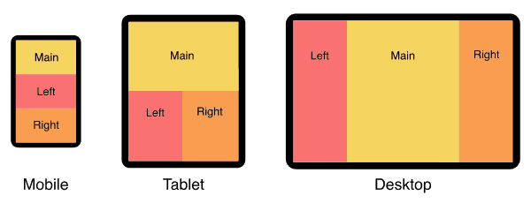
In this three-column layout, the main content column is in the center and sidebars are on either side. On mobile, the columns are stacked vertically and the main content comes first.
For a full page version that includes a header and footer see my holy grail responsive layout.
Live demo
The HTML
<div class="content-with-sidebars">
    <div>Main content</div>
    <div>Left sidebar</div>
    <div>Right sidebar</div>
</div>
The CSS
/* container */
.content-with-sidebars {
    display:flex;
    flex-wrap:wrap;
}

/* columns */
.content-with-sidebars > * {
    width:100%;
    padding:1rem;
}

/* tablet breakpoint */
@media (min-width:768px) {
    .content-with-sidebars > * {
        width:50%;
    }
    .content-with-sidebars > *:nth-child(1) {
        width:100%;
    }
}

/* desktop breakpoint */
@media (min-width:1024px) {
    .content-with-sidebars > * {
        width:25%;
    }
    .content-with-sidebars > *:nth-child(1) {
        width:50%;
    }
    .content-with-sidebars > *:nth-child(2) {
        order:-1;
    }
}
Padded Boxes With Headings (flexbox)
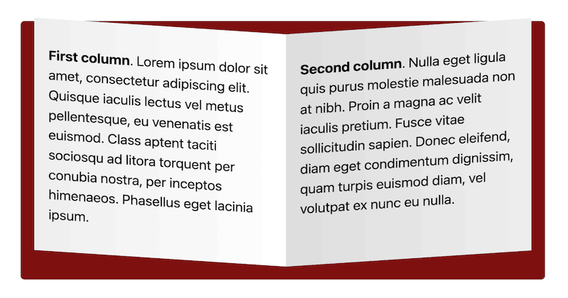
In this three-column layout, each column has a colored heading and a padded grey box of content. each box is separated by a gutter. On mobile, the boxes are stacked vertically, on tablet and bigger, they sit side-by-side.
Live demo
Heading 1
Lorem ipsum dolor sit amet, consectetur adipiscing elit. Quisque iaculis lectus vel metus pellentesque.
Heading 2
Nulla eget ligula quis purus molestie malesuada non at nibh. Proin a magna ac velit iaculis pretium.
Heading 3
Lorem ipsum dolor sit amet, consectetur adipiscing elit. Quisque iaculis lectus vel metus pellentesque.
The HTML
<div class="padded-boxes">
    <section>
        <h3 class="heading">Heading 1</h3>
        <div class="padded">
            <!-- box 1 content -->
        </div>
    </section>
    <section>
        <h3 class="heading">Heading 2</h3>
        <div class="padded">
            <!-- box 2 content -->
        </div>
    </section>
    <section>
        <h3 class="heading">Heading 3</h3>
        <div class="padded">
            <!-- box 3 content -->
        </div>
    </section>
</div>
You can add as many boxes as you like, they will simply wrap to multiple rows of three boxes wide.
The CSS
/* container */
.padded-boxes {
    display:flex;
    flex-wrap:wrap;
    gap:2rem;
}

/* boxes */
.padded-boxes > * {
    width:100%;
    background:#eee;
    border-radius:.4rem;
}

/* headings */
.padded-boxes .heading {
    background:#f97171;
    margin:0;
    padding:1rem;
    border-top-left-radius:.4rem;
    border-top-right-radius:.4rem;
}

/* padded content */
.padded-boxes .padded {
    padding:.1rem 1rem;
}

/* tablet breakpoint */
@media (min-width:768px) {
    .padded-boxes > * {
        width:calc((100% - 4rem) / 3);
    }
}
3 Column Product Feature Comparison Layout (flexbox)
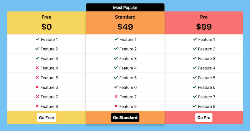
In this three-column layout, we compare product features and highlight the central product as the most popular. Here are the main features of this layout:
Mobile friendly: The three columns remail side-by-side on mobile. This is done by reducing the features to only ticks and crosses on the left and right options.
Highlighted option: The centeral option has been highlighted by lifting it above the others with a drop shadow, plus a 'Most Popular' banner is added.
Works on larger screens: On larger screens all three options are given the same width and the feature text appears in all. An outer margin is also added.
Live demo
Free
$0
- Feature 1
- Feature 2
- Feature 3
- Feature 4
- Feature 5
- Feature 6
- Feature 7
- Feature 8
Standard
$49
- Feature 1
- Feature 2
- Feature 3
- Feature 4
- Feature 5
- Feature 6
- Feature 7
- Feature 8
Pro
$99
- Feature 1
- Feature 2
- Feature 3
- Feature 4
- Feature 5
- Feature 6
- Feature 7
- Feature 8
The HTML
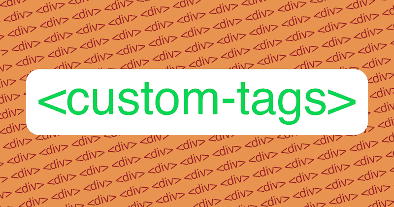
I'm using custom elements for this layout because it's cleaner and easier to read the code.
Want to use custom elements? Read my article first: Custom HTML Tags (18 Things To Know Before Using Them).
<feature-compare>
    <free-level>
        <h3>Free</h3>
        <p class="price">$0</p>
        <ul>
            <li class="tick"><span>Feature 1</span></li>
            <li class="tick"><span>Feature 2</span></li>
            <li class="tick"><span>Feature 3</span></li>
            <li class="cross"><span>Feature 4</span></li>
            <li class="cross"><span>Feature 5</span></li>
            <li class="cross"><span>Feature 6</span></li>
            <li class="cross"><span>Feature 7</span></li>
            <li class="cross"><span>Feature 8</span></li>
        </ul>
        <a class="button" href="#">Go<span> Free</span></a>
    </free-level>
    <standard-level>
        <h3>Standard</h3>
        <p class="price">$49</p>
        <ul>
            <li class="tick">Feature 1</li>
            <li class="tick">Feature 2</li>
            <li class="tick">Feature 3</li>
            <li class="tick">Feature 4</li>
            <li class="tick">Feature 5</li>
            <li class="tick">Feature 6</li>
            <li class="cross">Feature 7</li>
            <li class="cross">Feature 8</li>
        </ul>
        <a class="button" href="#">Go Standard</a>
    </standard-level>
    <pro-level>
        <h3>Pro</h3>
        <p class="price">$99</p>
        <ul>
            <li class="tick"><span>Feature 1</span></li>
            <li class="tick"><span>Feature 2</span></li>
            <li class="tick"><span>Feature 3</span></li>
            <li class="tick"><span>Feature 4</span></li>
            <li class="tick"><span>Feature 5</span></li>
            <li class="tick"><span>Feature 6</span></li>
            <li class="tick"><span>Feature 7</span></li>
            <li class="tick"><span>Feature 8</span></li>
        </ul>
        <a class="button" href="#">Go<span> Pro</span></a>
    </pro-level>
</feature-compare>
The CSS
/* container */
feature-compare {
    display:flex;
    margin-top:2.5em;
}

/* columns */
feature-compare > * {
    position:relative;
    padding:0;
    text-align:center;
    width:25%;
}
feature-compare > :nth-child(2) {
    width:50%;
    z-index:10;
    box-shadow:0 5px 10px rgba(0, 0, 0, 25%);
}
feature-compare > :nth-child(2):before {
    content:"Most Popular";
    display:block;
    position:absolute;
    top:-2em;
    left:0;
    right:0;
    line-height:2em;
    background:#000;
    color:#fff;
    border-top-left-radius:.4em;
    border-top-right-radius:.4em;
}
free-level {
    background:#f5d55f;
}
standard-level {
    background:#f99e50;
}
pro-level {
    background:#f97171;
}

/* features */
feature-compare ul {
    list-style:none;
    margin:0;
    padding:0;
    background:#fff;
}
feature-compare li {
    white-space:nowrap;
    line-height:2.2em;
    border-top:1px solid #eee;
}
feature-compare li:first-child {
    border-top:0;
}
feature-compare li.tick:before {
    content: '✓ ';
    color:#006e37;
    font-weight:bold;
    font-size:1.3em;
}
feature-compare li.cross:before {
    content: '✗ ';
    color:#ec1358;
    font-weight:bold;
    font-size:1.3em;
}
feature-compare h3 {
    margin:0;
    padding:.4em 0 0;
}
feature-compare .price {
    margin:0 0 .2em;
    font-size:2em;
    font-weight:bold;
}
feature-compare span {
    display:none;
}

/* buttons */
feature-compare .button {
    display:inline-block;
    margin:.5em 0;
    padding:.4em .5em;
    background:#fff;
    color:#000;
    text-decoration:none;
    font-weight:bold;
    border-radius:.4em;
}
feature-compare > :nth-child(2) .button {
    background:#000;
    color:#fff;
}

/* tablet breakpoint */
@media (min-width:900px) {
    feature-compare {
        margin:2.5em calc(8px + 1.5625vw);
    }
    feature-compare > * {
        width:calc(100% / 3);
    }
    feature-compare span {
        display:inline;
    }
}
The calc(8px + 1.5625vw) formula creates responsive padding that grows with your screen size. See my article for how it works: Responsive Padding, Margin & Gutters With CSS Calc.
Static 3 Column Layout (Responsive Attributes)
In this three-column layout, I use my Responsive Attributes system to layout the columns side-by-side.
Live demo
The HTML
My Responsive Attributes system uses three data-attributes to define the layout at each breakpoint (mobile, tablet, and desktop)
<div data-sm="3column">
    <div>1</div>
    <div>2</div>
    <div>3</div>
</div>
No CSS required
The Responsive Attributes system handles all the structural CSS for you. Learn how it works.
Responsive 3 Column (Responsive Attributes)
In this three-column layout, the columns are stacked on mobile then sit side-by-side on tablet. This is achieved with my Responsive Attributes system.
Live demo
The HTML
At the mobile breakpoint (small) it's one column and at the tablet breakpoint (medium) it's three columns. We don't need to specify the desktop breakpoint (large) because it will automatically remain 3 columns.
<div data-sm="1column" data-md="3column">
    <div>1</div>
    <div>2</div>
    <div>3</div>
</div>
No CSS required!
The Responsive Attributes system handles all the structural CSS for you. Learn how it works.
Static 3 Column Layout (Responsive Columns)
In this three-column layout, I use my Responsive Columns system to layout the columns side-by-side.
Live demo
The HTML
My Responsive Columns system uses tiny custom tags to define the layout:
<r-c join>
    <c1-3>
        1
    </c1-3>
    <c1-3>
        2
    </c1-3>
    <c1-3>
        3
    </c1-3>
</r-c>
No CSS required
The Responsive Columns system handles all the structural CSS for you. Learn how it works.
Responsive 3 Column (Responsive Columns)
In this three-column layout, the columns are stacked on mobile then sit side-by-side on tablet. This is achieved with my Responsive Columns system.
Live demo
The HTML
<r-c join>
    <c1-1 sm1-3>
        1
    </c1-1>
    <c1-1 sm1-3>
        2
    </c1-1>
    <c1-1 sm1-3>
        3
    </c1-1>
</r-c>
No CSS required!
The Responsive Columns system handles all the structural CSS for you. Learn how it works.
Full Browser Support
All layouts on this page are supported by over 96% of global browsers so they can be used in any production environment.
CSS grid and Responsive Attributes browser support
- Google Chrome 57+
- Mozilla Firefox 52+
- Microsoft Edge 16+
- Apple Safari 10.1+
- Opera 44+
- Android Browser 109+
- Opera Mobile 73+
- Chrome for Android
- Firefox for Android
Flexbox and Responsive Columns browser support
- Google Chrome 29+
- Mozilla Firefox 28+
- Microsoft Edge 12+
- Apple Safari 9+
- Opera 17+
- Android Browser 4.4+
- Opera Mobile 12.1+
- Chrome for Android
- Firefox for Android
- Opera Mini
Need to support old browsers?
If you need to achieve 3 equal-height columns in old browsers (back to IE 5.5) that don't support CSS grid or flexbox, you can use my nested equal-height columns method, here is an example of a 3 column layout without flexbox.
Do you know how HTML and CSS go together? See my beginners guide: How to add CSS to HTML (With Link, Embed, Import, and Inline styles).

Follow me on @mattjamestaylor


 Web design
 Architecture
 Life drawing
 Art gallery
 Synesthesia
 Comics